According to Google Images: Visual epistemologies of climate change and biodiversity loss
Team Members:
Warren Pearce, Elena Pilipets (facilitators), Maud Borie, Laura Bruschi, Ariel Chen, Daniele Dell’Orto, Matthew Hanchard, Alessandro Quets, Zijing XuContents
Project posters According to Google Images: Visual epistemologies of biodiversity loss and climate change- Team Members:
- 1. Introduction
- 2. Research Questions
- 3. Methodology and initial datasets
- 4. Findings
- 5. Discussion
- 6. Conclusions
- 7. References
- Presentation posters
1. Introduction
Google Images search engine is probably the most important online gatekeeper of visual culture worldwide, with over two billion searches conducted on the platform every day (Fishkin, 2018). Despite its importance, there is a scarcity of analyses on how the platform determines the visibility of images within its search rankings. For example, are ‘authority’ metrics in a similar way to its textual web search results (Birkbak & Carlsen, 2016)? Or do computer vision techniques offer new criteria for promoting images and the websites that host them? By addressing three core questions, the project builds a dataset of country-specific search rankings from Google Images for a range of search queries. We are interested in the image content, the linked web pages and how search results for image and text differ. We will also make use of a historic dataset of Google Images search results from 2019.2. Research Questions
Main Question: How does Google Images see and show climate change and biodiversity loss? Sub-questions:- To what extent does Google Images homogenise or diversify visions of climate change and biodiversity loss?
- How does the 2022 vision of climate change compare with 2017?
- What do these results tell us about Google Images’ ranking regime?
3. Methodology and initial datasets
The research followed seven protocols, as below: (1) Data was collected using anonymous Google Chrome/Mozilla Firefox accounts (to minimise personalisation effects). We searched both Google Images and Google Search with ‘biodiversity loss’ and ‘climate change’ as key terms’ for six countries: Mexico, Netherlands, Nigeria, China, Brazil and Australia. The top 50 images of these countries were selected and compiled into a dataset. Countries were selected to be representative of a range of geographical economic situations (at least one per continent), and types of engagement with climate change and biodiversity loss. We searched our key terms in English and in the official national language for each country i.e. for Google.nl we searched for ‘climate change’ and ‘klimaatverandering’. Comparing the top 50 results for each search (See Dataset 1) provided an overview of the most prominent visual rhetorics and images in circulation; (2) Using a Python script (See Script 1) to scrape the top fifty results garnered a .csv file (Dataset 2) with key characteristics of each image, i.e. the rank assigned by Google, the image url, webpage location, domain, as well as the image alt text, size and file extension type; (3) To examine the most similar/mobile images across datasets we used Google Cloud Vision (See Instructions 1) and Memespector (See Instructions 2). The returned .csv file (See Dataset 3) gathered detail on how the different computer Vision APIs categorise images. This included the labels used by Google Cloud Vision (e.g. tarantula; cliff; patas; fiddler_crab; mountain_bike), and web entities applied through Google’s web detection module to the fifty highest ranked images within each country (by relying on the detection of sites with matching images and web references that Google knowledge graph (see Singhal, 2012) assigned to images based on site-specific image captions). This provided us with an understanding of how highly ranked images for ‘biodiversity loss’ and ‘climate change’ compare between country-specific queries (See Research Question 1); (4) We manually coded the dataset to identify the most commonly recurring images both within each country (Dataset 4), requiring an analytical process of differentiating between identical and similar (augmented/amended versions of an image) infomed by semiotics. This provided an understanding of the types of images promoted by Google for particular search terms (See Research Question 2). Image Sorter was used to organise the images by country, and for the entire dataset, so as to get an insight into the ‘style spaces’ (Manovic 2011) of (i) the issues (aggregated) and (ii) each country. (5) We merged the country specific datasets into a master spreadsheet (in .CSV format) for each search term i.e. biodiversity loss (Dataset 5) and climate change (Dataset 6), and then used the master spreadsheets to identify the ten most commonly recurring images using Clarifai general concept to sort the images by the similarity (sorting the column from A to Z). We also accessed Google Vision API’s web detection feature through Memespector to identify the websites containing images that fully match the top three ‘perfectly repeating’ stock images per search query; (6) One of our project aims (See Research Question 3) was to compare Google’s Search and Images search engine results. We used a VPN (CyberGhost VPN) and gathered our data using anonymous Mozilla Firefox accounts. The two queries were searched in both English and the country’s native language (if not English), replicating what we did in Protocol 1. We scraped Google’s Search engine using the Search Engine Scraper (DMI, 2010) and extracted the domain of the first 10 ranking websites. We compared the results of the queries in each country using the Triangulate tool (DMI, 2008); (7) We conducted a social semiotic analysis to deconstruct the visual grammar of the most recurring five images in the climate change dataset and biodiversity dataset (10 images in total). This enabled us to address Research Question 2. To do so, we mainly draw on the analytical tools outlined by Kress & van Leeuwen (1996). This allowed us to show more detailed representational characteristics and patterns of the images that are not able to identify by digital methods. Social semiotics has also enabled us to reveal the subtle ideological messages that are embedded in this Google Images collection. As outputs, alongside the seven datasets and this Wiki, we also produced two posters. The design of the posters required several decisions on how to reduce the data and what to include or exclude. Data and protocols were collated in a shared Google Drive folder. A range of tools were used for data collection, in particular a Python script and Downloadthemall, and for data analysis: Clarifai, Cloud Vision, Memespector, Imagesorter, Rawgraph and Gephi. Data was centralised in csv format using google spreadsheets. We circulated around the images, displaying them in different ways: according to the initial Google Image ranking (as on the image wall), using most frequent labels and web entities, and also by colours. Google Cloud Vision API web detection feature draws and updates its information in relation to the authority of landing pages an image is attached to. By default, Google limits the range value to ten pages containing full matching images (this can be changed in the "maxResults" settings). Where the total number of full matching images exceeds 10, it is unclear how Google chooses which to include in the Google Vision results. One possibility, based on observation of Google Vision results in this and previous projects, is that the number of clicks on images and previous user queries (known as query logs) that match image captions can influence the prioritisation of both web pages and web entities in the results. Query log information may also be used to associate locations with websites and web pages (Slawski 2012).4. Findings
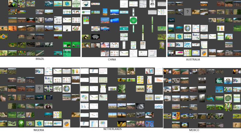
Through our analyses of the different datasets we found a set of similarities and differences between the prevalent Images in each country for each search term. Below, we set out our analysis of [biodiversity loss] and [climate change] separately, before bringing them together in the Discussion and Conclusion sections.4.1. Biodiversity Loss
4.1.1. Biodiversity loss: Differences between countries
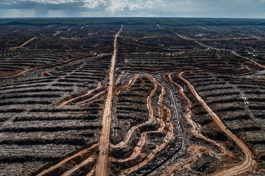
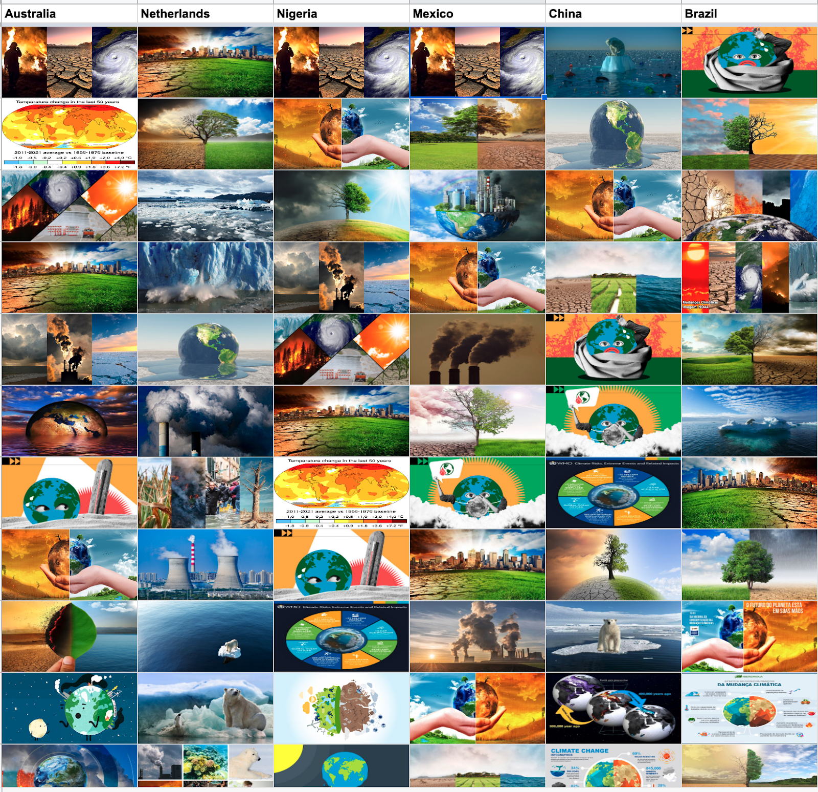
We retrieved 50 images for each of the six countries (n = 300 images) with [biodiversity loss] as the search term. Some images are widely represented, in particular images of damaged forests as well as a significant number of images showing a lonely animal in front of a damaged ecosystem. The analysis of each dataset however suggests that some differences exist between countries (see Figure 1). For Australia, Mexico, and Nigeria damaged forests are present in roughly 50% of the top 50 images (Table 1, Figure 2). In the Netherlands, the share of forest-related images is low, with a greater number of scientific graphs and charts. The China results are even more dominated by images containing text and graphs, with barely any representation of ecosystems and none at all of damaged forests.
|
Biodiversity loss | Damaged forest on image | % |
| AUSTRALIA | 23 | 46% |
| NIGERIA | 25 | 50% |
| MEXICO | 25 | 50% |
| NETHERLANDS | 4 | 8% |
| CHINA | 0 | 0% |
| BRAZIL | 16 | 16% |
The dominance of forests as the main visual proxy for ‘biodiversity loss’ leaves some key aspects of global biodiversity policy absent from the search results (e.g. oceans, wetlands, meadows, polar regions). Overall, no single image dominates the dataset, but different “family of images” (genres) are dominant. We can broadly characterise these as:
-
Images of degraded forests;
-
Images containing scientific materials (graphs);
-
Cartoonesque depictions (e.g. educational material); and
-
Generic ‘global’ images bearing some similarity with the ones found in the climate change dataset (see below).
While the most repeated images across countries are images of degraded forests used as proxy for biodiversity loss (figure 2) and scientific diagrams depicting the issue (figure 3).
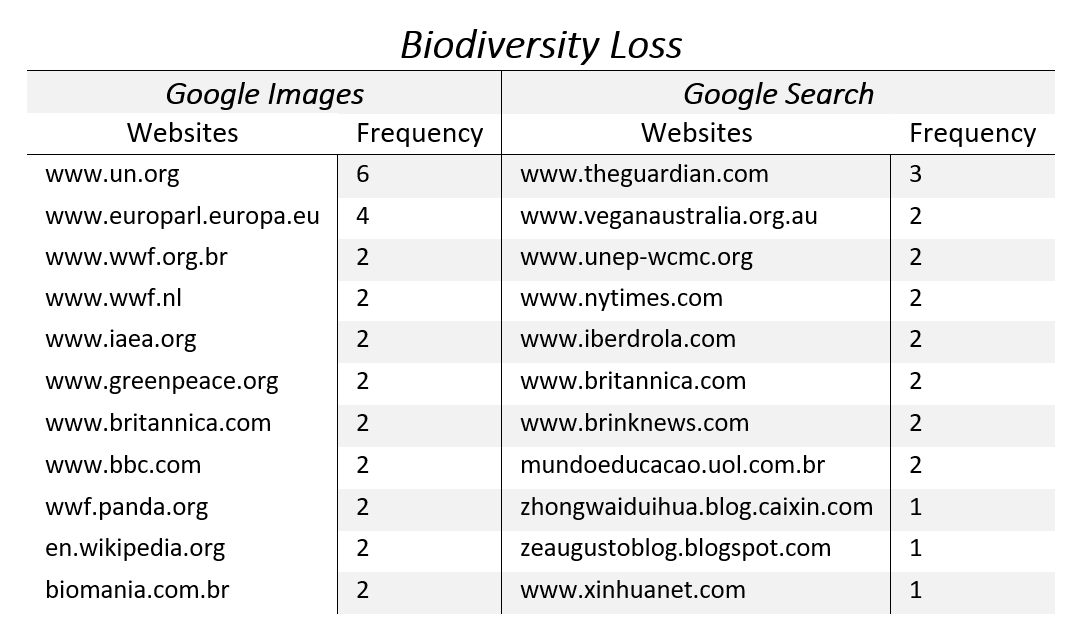
4.1.2. Biodiversity loss: Comparing Google’s search ranking criteria
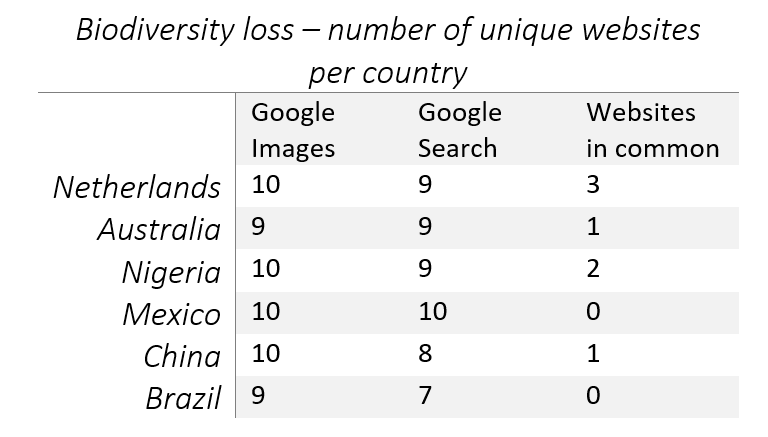
For the six countries there is little to no overlap (max: 3, min: 0) between the top search results associated with [biodiversity loss] on Google Images compared to those on Google Search. This suggests that the ranking logic of Google Images is very different from the one of Google Search. A broader range of websites are associated with Google Images. We used the Triangulate tool to compare the search results (for an example, see Figure 4).
Table 2 shows the number of unique websites found in the top 10 results when querying [biodiversity loss] on Google Images and Search. The Netherlands is the country that shares the most websites between the two engines: these are Wageningen University & Research, the European Parliament and Compassion in World Farming, a worldwide NGO which aims to end factory farming practices, one of the main causes of biodiversity loss. Australia shares the encyclopaedia The Britannica, which can also be found in Nigeria alongside the website of a multinational electric utility company. Finally, China only shares the International Atomic Energy Agency’s website.
4.2. Climate Change
4.2.1. Climate change: Similarities and differences between countries
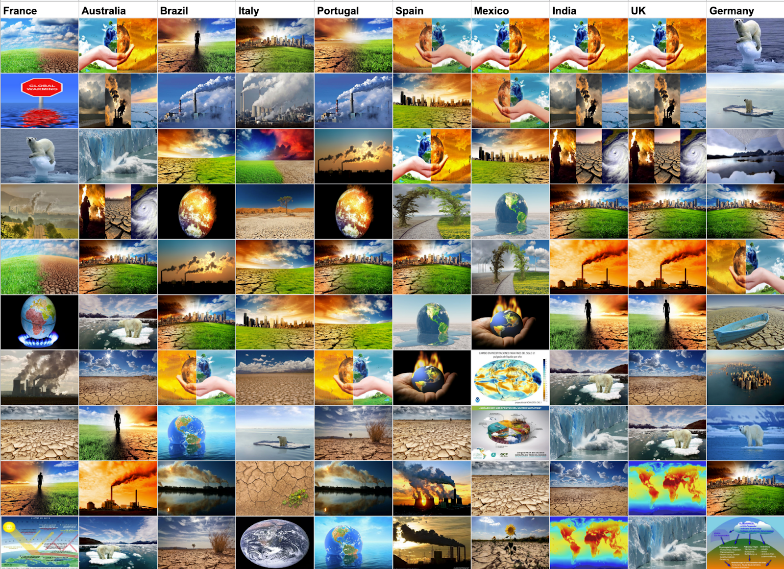
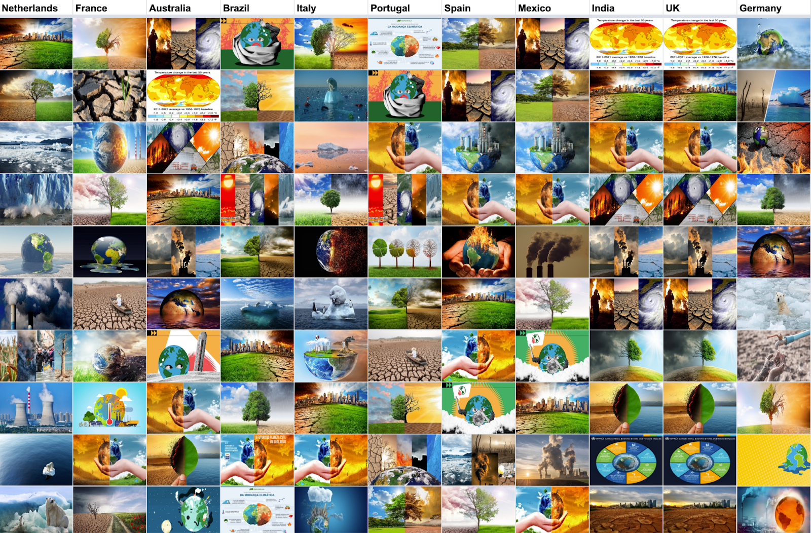
With the search term [climate change], we retrieved 50 images per country and 300 images in total. Overall, the image results for climate change exhibit a lot of similarity across the six countries, with images of natural landscapes, trees, the Earth, oceans and ice and some charts and data visualisations. The Earth appears cartoonised and/or augmented through manipulated photographic representation in different contexts. For example, (1) anthropomorphic earth wearing thick cloth and mask, being hot and sweaty, (2) fake images show a human hand holding the Earth; and (3) photographic earth floating on the sea. The ocean and icebergs usually appear together, sometimes accompanied by a lone polar bear standing on the melting ice. Most images contained trees, and were split half and half between lush green trees and blue skies to one side, contrasting with withered trees and dry land often on the other. People appeared in very few images, but when they did there was a similarity in the visual rhetoric employed across different countries. Here, most images presented a solitary human facing away from the viewer and looking across an endless horizon showing a parched drought-ridden landscape.
Further analyses of the different datasets revealed disparities between countries. For Brazil and Mexico, images containing text and emission of greenhouse gases were presented most frequently. Meanwhile, the dataset for China shows a quarter of its images contain polar bears and penguins, and it also indicated that climate change is regarded as a politically charged issue there, with international cooperation emphasised (see Figure 6).

Despite the positioning differences of images between countries, it is important to notice that images that emerged in each country shared similar characteristics. Notably, images tend to present the consequences of climate change and its impact on biodiversity loss such as intense drought, floodings and melting glaciers, but human actions and/or solutions were absent. These images are also decontextualised as time, place, and human faces are blurred. Additionally, a broad range of generic images appear such as utopian and dystopian, and half and half images. Specifically, the series of generic images with anthropomorphic earth are illustrations taken from an article posted the UN website (see Figure 7).

4.2.2. Climate change: Composition
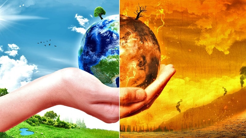
Half and half image composition is particularly dominant in our dataset, examples can be seen in Figures 8 and 9. Kress and Van Leeuwen (1995; 1996) argue that visual composition plays an important role in meaning creation. Figure 8 is what these scholars described as the left and right layout, which places ‘one kind of element on the left and another, perhaps contrasting element on the right’ (1995, p.27). In such a layout, elements on the left are presented as the given, something that the reader already knows. In contrast, elements on the right are presented as the new, something that is not yet known to the reader. Following such logic, the elements on the right are the crucial points of the message, the issues that the reader should concentrate on.
In Figure 8 we see the overly heated planet, communicated through the dried-up earth, flaming city, and gloomy fiery skies, is placed on the left-hand side. On the contrary, on the right-hand side, we see the idealised planet, realised through rich green flourish grass, clean skyscrapers, and saturated bright blue skies. Following Kress and Van Leeuwen (ibid), the overly heated planet is presented as the given (in the present), communicating to the reader that this is the situation we are in right now and climate change has already brought this effect on our planet. The idealised planet, on the right, is however what we should focus on, and probably work towards for our future. This composition portrays a sense of optimism, encouraging the reader to see a utopian future.
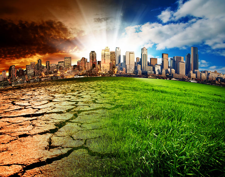
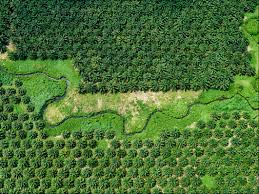
Figure 9 is what Kress and van Leeuwen call the top-bottom layout, which they believed to be useful for communicating the concept of ideal versus real. Elements in the upper section are something to be ideal while, perhaps constructing, elements in the bottom section are something to be real. In this case, the top section is, therefore, the ideologically salient part, as it presents the idealised or generalised essence of the information. The bottom section on the other hand presents more specific, detailed, and down-to-earth information. As we see in Figure 8, the top section presents a dense forest while the bottom section depicts a sparse forest. In this image, deforestation is communicated as something real through its image layout and dense forest on the other hand is something the viewer should be aspired to.
We also find images that have flipped the left-right composition of dystopia/utopia. In Figure 10, the idealised planet is shown in two different formats. In the first image, the given (on the left) is a dystopian overheated planet, while the more utopian ‘natural’ Earth is in the future (on the right), similar to Figure 8. However, in the second image, this order is flipped, representing a shift from utopia to dystopia. A future project could conduct further analysis to see if these semiotic readings of the images are reflected in the wider web contexts within which these images are used. This can help to build a more comprehensive understanding of the dystopian and utopian connotations of these images.

4.2.3 Climate change, comparing stubborn images from 2017-2022
Finally, we compared the results from 2022 to the results from the 2017 DMI Summer School project Making Climate Visible, adding some more countries so that the results were comparable between the two dates.
2017:
2022:
We found a number of ‘stubborn images’ from 2017 that remained highly prominent in 2022; for example, ‘triptych’ (ranked 1 in Australia, 2022), ‘landscape’ (Figure 7) and ‘earth in hand’ (Figure 9). There were some new entries in 2022, notably trees and leaves are a new development (perhaps reflecting the increased interest in nature-based solutions), the UN’s ‘sick Earth’ cartoons, and the global temperature map featured prominently on Wikipedia. There was also an overall decline in polar bears, often described as an iconic representation of climate change (Born, 2018). However, what is striking is the overall similarity in Google’s visual representation of climate change over five years: a persistence in the platform’s bias towards dehumanised depictions of the issue (Pearce & de Gaetano, 2021).
4.2.4 Climate Change: Comparing Google’s search ranking criteria
The comparison between Google Images and Search for [climate change] gave similar results to that for [biodiversity loss]. Here, as it can be seen in Table 3, the maximum overlap in the six countries, which we calculated using the Triangulate tool (for an example see Figure 12), was of 2 websites.

The United Nations and Nasa’s websites are found in the results for Australia, Nigeria and Mexico. While China only shares the United Nations’ website, it is relevant to note that it appeared 9 out of 10 times in Google Search, with the 10th website being the news.un.org website, the daily news website of the United Nations. Brazil is the only country in which we found the local United Nations’ website (brazi.un.org), which is shared alongside a didactic website (https://brasilescola.uol.com.br). Nonetheless, despite the strong presence of “authoritative” websites shared among the two engines, Google Images’ results contained a broader range of sources overall, including Wikipedia, social media, local companies and news outlets and personal blogs.

4.3. Web entities across countries
The matrix was created by calculating the frequencies of web entities per country in Google Spreadsheets and visualizing the results with RawGraphs using color saturation. Web entities are the references that Google Vision API detects on the web, based on the site-specific textual environments of the matching images. The matrix comparing two queries shows the shifts in relations of relevance that web entities reproduce across country-specific domains. It also shows the extent to which well-established shared terms such as “climate change” and “global warming” are represented in the “biodiversity loss” space. While “climate change” significantly falls in rank, “nature” appears to be more visible, indicating stronger variation in ‘real life’ images of e.g., deforestation. In the “climate change” space, web entities are dominated by more official ‘science-y’ terms.
4.4 Google Images and Google Search: rank comparison
As specified in section 4.1.2 and 4.2.4, we found little to no overlap between the websites of Google Images and Google Search. In this section we report the frequency of the unique websites per query. Overall we noticed that Google Search results tend to focus on reliable and authoritative sources (e.g. United Nations, Nasa, IPCC) and that Google Images’ results are more diverse, containing a mix of authoritative sources and NGOs as well as local news outlets, small businesses and organisations, and images taken from social media. However, there is a noticeable difference between Table 4 and Table 5, as the Google Images’ websites for [biodiversity loss] show less variation than those for [climate change]. This could be due to the fact that climate change is a better known (and searched) issue than biodiversity loss, leading to a difference in the number of websites that contain the query [biodiversity loss]. Furthermore, as [biodiversity loss] is a more “academic” and less publicly-known term, it is possible that the query is used on more “authoritative” websites.While taking account of these issue-specific differences between the search queries, the low number of overlap among the websites clearly demonstrates a different ranking logic between the two search engines. Finally, it is notable that 9 out of 10 Search engine results related to China belonged to the United Nations’ website, thus skewing the results presented in Table 4.

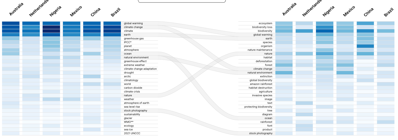
4.5 Comparing Google labels and web entities
Analysis of the most popular words used by Google Vision to characterise the images shows significant differences between our two issues. For climate change many terms are related to atmosphere sciences and a couple of institutions are present (e.g. IPCC) whereas for biodiversity loss no political actor is mentioned (e.g. IPBES). While some keywords are shared (e.g. ecosystem, nature, natural environment), overall the web entities linked to the two search terms are largely separate from each other.
| Climate change | Biodiversity loss | ||
| Web Entity | Global_occurrences | Web Entity | Global_occurrences |
| global warming | 235 | ecosystem | 111 |
| climate change | 230 | biodiversity loss | 101 |
| climate | 213 | biodiversity | 95 |
| earth | 200 | global warming | 91 |
| greenhouse gas | 90 | earth | 79 |
| intergovernmental panel on climate change | 75 | species | 76 |
| planet | 68 | organism | 70 |
| atmosphere | 67 | nature maintenance | 63 |
| ocean | 59 | nature | 61 |
| natural environment | 48 | habitat | 56 |
| greenhouse effect | 36 | deforestation | 53 |
| extreme weather | 35 | forest | 48 |
| climate change adaptation | 30 | climate change | 45 |
| drought | 29 | natural environment | 45 |
| arctic | 24 | extinction | 34 |
| climatology | 24 | global biodiversity | 31 |
| world | 23 | amazon rainforest | 30 |
| carbon dioxide | 22 | habitat destruction | 27 |
| climate crisis | 20 | agriculture | 23 |
| nature | 19 | invasive species | 21 |
4.6 Studying Stock image spaces and their multi-situatedness
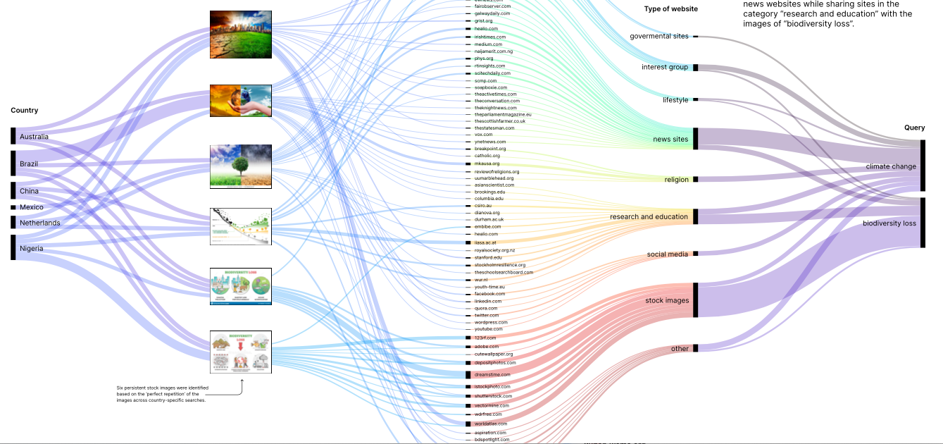
After selecting three stock images per query based on their ‘perfect repetitions’ and persistence across countries, the total of six image urls has been used as an input into Google Cloud Vision API web detection module—”websites with full matching images”. In total, Google Vision API identified 77 unique pages containing matching images, which then were manually coded in nine categories (governmental sites, news media, interest group, lifestyle, religion, research and education, social media, stock image sites, and other) and visualized as relations of co-occurrence between images, countries, and search terms. The resulting alluvial diagram (made with RawGraphs) elevates these relations as overlapping flows, pointing to the distributed nature of stock image “style spaces” (Manovich 2011) that vary in the extent to which they are shared and multi-situated (see Figure 14). By focusing on the intersections of web locations and country-specific image-query relations (climate change and biodiversity loss), this technique highlights the value of studying images as data-intensive objects of circulation. Here, a style space is not only characterised by a distinctive visual pattern (e.g. by color, content similarity), but also permits the grouping of images in accordance with their transcontextual dynamics.
The main findings from this analysis are:
-
Persistent stock images for climate change are ‘half and half’ stock images showing a montage of perspectives, while persistent images for biodiversity loss are charts and cartoonesque representations.
-
Climate change stock images are distributed more widely around the web than the stock images for biodiversity loss are less widely distributed and so are more closely associated with the stock image websites they originate from.
-
Climate change images frequently appear on news websites while sharing multiple sites in the category “research and education” with the images of biodiversity loss.
-
Specific sites using climate change stock images are active in the areas of lifestyle and religion. The biodiversity loss stock image space is yet to be established beyond the areas of news, research, and education.
This visualisation helps us to rethink the notion of ‘style spaces’ in terms of multi-situatedness, so that ‘space’ becomes a metaphor for the distribution of images across the web, and the contexts within which these images sit. So a style space corresponds not only to its contents but also the different web spaces within which the images are found. What is important here is that the properties of the images enable their continued circulation and reproduction, as their stubbornness in Google search rankings maintains their high global visibility, which in turn prompts further circulation. So the style space is notable not only for its aesthetic qualities, but also for its continuous reproduction and recontextualisation.
In the next section, we discuss our empirical results with respect to the medium of Google Images and the environmental issues being represented in the imagery.
5. Discussion
5.1. Explaining our results through medium-specific and issue-specific features
For both climate change and biodiversity loss, the visuals retrieved from Google were decontextualised, often placeless and faceless, with a broad range of generic images. Echoing Jasanoff’s argument on the construction of global climate change (2010) these images appear detached from local meaning and human experience. For climate change a significant number of images include a representation of the Earth or a generic image. The causes of climate change itself are not represented. For biodiversity loss only one manifestation of the problem is represented: deforestation. These images locate biodiversity loss as something taking place predominantly in tropical forests. While partially true this is problematic in at least two different ways: (i) biodiversity loss is multifaceted and cannot be reduced to something affecting only forest ecosystems and related only to deforestation and; (ii) this representation may not facilitate engagement with the problem, situating it as something geographically distant from where the Google searches take place.
5.2. Medium-specific features
Following Marres (2015, p.675) we need to reflect on the extent to which our results reveal “medium-specific features” (related to Google Images) and/or “issue-specific activity” (related to environmental images). Regarding the medium, the prevalence of particular types of images points to the importance of ‘visual consistency as a driver of rankings in Google Images (Huang et al., 2011), resulting in homogenisation of visual representations in three ways. There is clear evidence of issue homogenisation, with both climate change and biodiversity loss producing distinctive country-specific style spaces of generic imagery, in terms of content and composition. For climate change, there is also evidence of geographical homogenisation where the style space is visible across a range of different countries (there is some evidence of this for biodiversity loss too, but with some key outliers such as China). For climate change there is also evidence of temporal homogenisation where the style space, and indeed specific images, from 2017 stubbornly remain present in 2022 despite the significant changes in the public debates and visibility of climate change since during that time.
This suggests that image content is important in determining search rankings, but what about the websites that are hosting the images? Our comparison of search results for Google Search and Google Images helped to identify the extent to which their ranking logics differed. as little to no overlap was found between the most prominent websites. The comparison showed that the two different search engines provided mostly different websites in their results, suggesting that the requirement for visual similarity was a more significant driver of search rankings than any of the authority-based metrics upon which Google Search results are (to some extent) based. Web sources ranked by Google Images include social media websites, local NGOs, news outlets and small businesses, worldwide news agencies as well as research centres and institutions such as NASA and the United Nations (UN). Other images, especially in the biodiversity loss dataset, are recurring and highly ranked because they are stock images. Google Search results, on the other hand, tend to be prioritised according to the source, as there is a dominance of “authoritative” sources, such as NASA, the United Nations, the Intergovernmental Panel on Climate Change (IPCC) or World Wildlife Fund. These results suggest that a website’s high ranking in Google Search does not automatically translate into a high ranking in Google Images. This finding reinforces the importance of visual similarity in determining Google Image search rankings.
5.3. Issue-specific features
While medium-specific features can explain homogenisation of the style spaces, they cannot explain the content of the images themselves. Here, we have to return to the existing literature on environmental imagery and representation. As already discussed, the emergence of climate change as a scientific and political issue is closely associated with a ‘planetary view’. Different global representations of Earth have helped give rise to a “global environmental consciousness” imagining the world as a single community in peril, including the global circulation models and charts of climate science and images of the Earth taken from space (Jasanoff, 2001; 2004; Miller, 2004). This globalisation of environmental knowledge has moved the perspective away from local subjectivities towards a ‘view from nowhere’ in which specific people and places fade from view (Borie et al., 2021; Pearce & de Gaetano, 2021). So we can identify clear links between the history of environmental representations (in imagery and knowledge production) and our research findings. In short, the issue-specifics (i.e. development of environmental representations) has influenced the content of high ranking search results on Google Images, while medium-specifics (the use of computer vision techniques) has constricted this style space around a relatively set of images.
For biodiversity loss, the homogenisation effect of the Google Images medium clearly remains important. However, the emergence of biodiversity loss as a global issue has followed a different trajectory from climate change, with greater attention being paid to local, place-based knowledge (Borie et al., 2021). There is evidence of this in the image rankings, with the presence of photographic images that, while not recognisable as a specific location, are more clearly identifiable as a particular type of place; most notably, the prominence of photos depicting deforestation and afforestation. However, the importance of scientific knowledge is still clear within the images, with the use of scientific charts and data visualisations. As discussed in section 4.3, there is little in common between the two sets of results. Despite the clear links between the two issues, they are being visualised very differently by Google Images.
6. Conclusions
Google Images has a homogenising effect on the visual vernaculars of both climate change and biodiversity loss. For climate change, generic representations of climate change dominate. In particular, a small number of “iconic” stock images are highly ranked across the different countries. Many of these images have a half and half “left/right” layout suggesting the current, often dystopian, situation on the left, with a more hopeful utopian future on the right (occasionally this implied temporality is reversed). Examples of these images include “hand in earth”, “landscape” and “tree”. For biodiversity loss, there is also homogeneity, although with some greater country-specific diversity. Stock imagery is less dominant, but half and half images remain important, such as ‘forest as lungs’. Although biodiversity loss covers many different aspects of environmental degradation, the imagery focuses almost exclusively on deforestation. Images appear to be ranked on whether they “accord” with Google’s envisioning of climate change as time-less, placeless, human-less and cause-less. Websites not according to Google’s visions of climate change and biodiversity loss are unlikely to be ranked highly by Google Images.
These findings are important because they highlight the narrow range of imagery used to represent environmental problems, and how this homogenisation of imagery has its roots in both the production of environmental knowledge and the ranking regime of Google Images. They invite us to consider the ways in which Google is presenting and representing the issues of climate change and biodiversity loss through millions of daily web searches around the world, and what interventions could be made to pluralise this imagery.
Limitations to the research project include the necessarily limited number of countries being researched, and the focus on only one search engine company. Future research in this area could expand both the range of countries and range of search engines under consideration. A more in-depth longitudinal study could also be undertaken, but this would require regular data collection on a regular basis as there is no API access to historic search rankings.
7. References
Birkbak, A. & Carlsen, H. (2016). The Public and Its Algorithms, in: Amoore, L. and Piotukh, V. (Eds.), Algorithmic Life: Calculative Devices in the Age of Big Data, (pp. 21–34). Abingdon: Routledge.
Born, D. (2019). Bearing Witness? Polar Bears as Icons for Climate Change Communication in National Geographic. Environmental Communication, 13(5), 649–663.
DMI (2008). Triangulation [Software]. Available at: https://tools.digitalmethods.net/beta/triangulate/
DMI (2010). Search Engine Scraper [software] available at: https://tools.digitalmethods.net/beta/searchEngineScraper/
Fishkin, R. (2018). New Jumpshot 2018 Data: Where Searches Happen on the Web (Google, Amazon, Facebook, & Beyond). SparkToro. Retrieved January 25, 2021, from https://sparktoro.com/blog/new-jumpshot-2018-data-where-searches-happen-on-the-web-google-amazon-facebook-beyond/
Hansen, A. and Machin, D., 2008. Visually branding the environment: Climate change as a marketing opportunity. Discourse Studies, 10(6), pp.777-794.
Huang, J., Yang, X., Fang, X., Lin, W. & Zhang, R. (2011). Integrating Visual Saliency and Consistency for Re-Ranking Image Search Results. IEEE Transactions on Multimedia, 13(4), 653–661.
Jasanoff, S. (2001). Image and Imagination: The Formation of Global Environmental Consciousness. Changing the atmosphere: Expert knowledge and environmental governance, 309–337.
Jasanoff, S. (2004). Heaven and Earth: The Politics of Environmental Images, in: Jasanoff, S. and Martello, M. L. (Eds.), Earthly Politics: Local and Global in Environmental Governance, (pp. 32–52). Cambridge, MA: MIT Press.Jasanoff, S. (2010). ‘A New Climate for Society’, Theory, Culture and Society, 27(2-3). pp. 233-253. doi: 10.1177/0263276409361497.
Kress, G, & van Leeuwen, T. (1996). Reading Images: The Grammar of Visual Design. New York: Routledge.
Leclère, D., Obersteiner, M., Barrett, M., Butchart, S.H., Chaudhary, A., De Palma, A., DeClerck, F.A., Di Marco, M., Doelman, J.C., Dürauer, M. and Freeman, R., 2020. Bending the curve of terrestrial biodiversity needs an integrated strategy. Nature, 585(7826), pp.551-556
Manovich L (2011) Style space: How to compare image sets and follow their evolution. Available at: http://manovich.net/content/04-projects/073-style-space/70_article_2011.pdf
Marres, N. (2015). Why Map Issues? On Controversy Analysis as a Digital Method. Science, Technology & Human Values, 40(5), 655–686.
Miller, C. A. (2004). Climate Science and the Making of a Global Political Order, in: Jasanoff, S. (Ed.), States of Knowledge: The Co-Production of Science and the Social Order, (pp. 46–66). London: Routledge.
Pearce, W. & Gaetano, C. D. (2021). Google Images, Climate Change, and the Disappearance of Humans. Diseña, 19(3). Available at: dx.doi.org/10.7764/disena.19.Article.3
Pettorelli, N., Graham, N., Seddon, N., Maria da Cunha Bustamante, M, Lowton, M., Sutherland, W., Koldewey, H., Prentice, H. and Barlow, J. (2021). ‘Time to integrate global climate change and biodiversity science‐policy agendas’, Journal of Applied Ecology, 58(11), pp. 2384-2393. doi. 10.1111/1365-2664.13985.
Slawski, B. (2012) How Google Might Use Query Logs to Find Entity Locations. Available at: https://www.seobythesea.com/2012/06/google-query-logs-locations-entities/Singhal, A. (2012). ‘Introducing the Knowledge Graph: things, not strings’, The Keyword [Blog]. Available at: https://blog.Google/products/search/introducing-knowledge-graph-things-not /
Torres, G. & Rogers, R. (2020). Political News in Search Engines: Exploring Google’s Susceptibility to Hyperpartisan Sources during the Dutch Elections, in: Rogers, R. and Niederer, S. (Eds.), The Politics of Social Media Manipulation, (pp. 97–123). Amsterdam: Amsterdam University Press. Retrieved from https://doi.org/10.2307/j.ctv1b0fvs5.5
Watts, J. (2018). Stop biodiversity loss or we could face our own extinction, warns UN. The Guardian. Retrieved from https://www.theguardian.com/environment/2018/nov/03/stop-biodiversity-loss-or-we-could-face-our-own-extinction-warns-un on July 29th, 2022Presentation posters
[[https://doi.org/10.15131/shef.data.20394018][ According to Google Images: Visual epistemologies of biodiversity loss and climate change]]Ideas, requests, problems regarding Foswiki? Send feedback