STUDYING PLATFORM VISUAL VERNACULARS USING DIGITAL METHODS
GROUP MEMBERS
Project leaders: Warren Pearce, Suay Ozkula Facilitators: Sabine Niederer, Natalia Sanchez-Querubin Team: Jennifer Bansard, Philip Hutchison Barry, Andrea Benedetti, Alessandra Cicali, Anne van den Dool, Laura Drakopulos, Beatrice Gobbo, Amanda Greene, Esther Hammelburg, Janna Joceli Omena, Phillip Morris, Alessandra Del Nero, Elaine Rabello, Mischa Szpirt, Rebekka Stoffel, Lauren Teeling, Emile den Tex, Sofie Thorsen, Rasmus Tyge HaarloevINTRODUCTION
The temporal and geographical scales of climate change present a challenge to communicators in public debates. How can a long-term, global condition be made a matter of immediate, local concern? This puzzle has contributed to climate change communication becoming a well-established research field. Yet the majority of this research is based in textual analysis (for a review, see Pearce et al, 2015). In this project, we use a variety of digital methods to investigate the images that are associated with climate change across a range of locations on the web. In doing so, we show that there is no single visual language of climate change. Rather, we identify six platform vernaculars (Gibbs et al, 2014), distinct to particular locations and social media platforms on the web. These vernaculars chime with a recent call by Climate Outreach for a new iconography of climate change, that goes beyond cliches of smokestacks and polar bears to develop “a new – more diverse, compelling, and powerful – visual language for climate change” (Corner et al., 2015). The report identifies seven principles for visual communication of climate change: show 'real people', not staged photo-ops; tell new stories; show climate causes at scale; climate change impacts are emotionally powerful; show local (but serious) climate impacts; be very careful with protest imagery; and, understand your audience. Our findings confirm that climate change visual communicators should indeed take notice of their audience, but that on the web this takes distinctive location-specific forms. Indeed, we suggest that communication strategies can be enriched by understanding publics as platform publics embedded in communicative spaces, with distinct aesthetics and affordances. In short, we ask, can one make visual climate change communication platform-friendly?
Theoretically, the project builds on the notion ‘that each social media platform comes to have its own unique combination of styles, grammars, and logics, which can be considered as constituting a ‘platform vernacular’” (Gibbs et al, 2014). Indeed, new genres of ordinary communication emerge from the affordances and constraints of communicative spaces and the dynamic habit-formation and creative expressions of users within these spaces. Hashtags, participatory features, ‘likes’, retweets, reposting, limited character space, and social metrics shape communication in fundamental ways. Consequently, in our research we approach climate change communication as a phenomenon that is taking place in and through social media platforms and that is in turn animated and constrained by their communicative infrastructure. We suggest that one can find climate change communication in the form of platform vernacular and ‘explore the implications of this vernacular mode of visual communication’.We set out to study climate change visual communication in six social media platforms: Facebook, Instagram, Reddit, Twitter, Tumblr, and Google Images. The challenge at hand is to do so in ways that account for their platform, digital, and network nature. Methodologically, we then turn to digital methods, a framework for doing social and cultural research with online data. Its credo, so to speak, involves repurposing the methods embedded in digital platforms and devices in service of social and cultural research. A digital methods approach lends itself to studying platform vernacular; it accounts, involves, and challenges the operations and practices that are native to the medium. In our case studies, for example, the search capacities of platforms and the metadata associated with the results — what is called ‘search as research’— are made epistemologically valuable anew. Subsequently, engagement and ranking metrics of each platform are employed to filter and create subsets of ‘most engaged with’ images. The goal here, as mentioned before, is to profile each platform in terms of visual climate communication vernacular. The analysis combines different techniques: top engaged images per platform are superimposed using photoshop so that visuals merge and can be the annotated, using also traditional content analysis. We attend to the broader datasets in a number of substudies including the Google Visual API and (visual) network analysis.
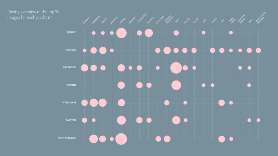
The analysis allows concluding that indeed each platform has different vernaculars. We have summarized them as follows:
-
Instagram ‘awareness travelling’: beautifully edited, travel pictures that provide an insider’s perspective and action shots. Experience-based, not informational. It's not national geography but the insta- world traveller. It overlaps with instagram's travelling culture.
-
Tumblr’s environmental ‘screenshotting’: Screenshots from other social media platforms and GIFs depicting noteworthy movement in which ‘skeptics’ are put in their place. ‘Iconic’ moments.
-
Twitter: ‘in the moment’: more in sync with ‘breaking news’, and a site of contestation.
-
Reddit: trending mainstream media. Most images on selected specialist sub-reddits come from articles (mostly mainstream news sources) being linked-to by the users. Because of this, the images tend to feature politicians (especially Donald Trump), political or diplomatic events and sometimes also demonstrations and protesters. Smaller sub-reddit forums, however, tend to use more user-generated images.
-
Facebook (expert accounts) ‘shareable statements’: Non-controversial statements, written in a large font, overimposed to known personalities or cute animals. Offer the opportunity for appropriation.
-
Google: hyperbolic and cliches images. A more garish array of images that are the furthest away from the guidance suggested by Climate Outreach. No relationship with the ‘standard’ web search
The relationship between these vernaculars and Climate Outreach’s communication principles will be expanded upon below. For the moment, it is sufficient to emphasise that the application of any communication principles should be sensitive to local platform vernaculars.
RESEARCH QUESTIONS
Do Facebook, Instagram, Reddit, Twitter, and Tumblr, and Google image search have distinct visual vernaculars for the issue of climate change?AIM
Describe how visual communication about climate change adopts a platform vernacular per social media platform.METHOD: CROSS-PLATFORM COMPARISON
To visualize users’ visual experience of climate change online, a cross-platform image comparison, and smaller subsets of data from 6 platforms were coded along 40 questions. The platforms included Facebook, Instagram, Google, Reddit, Twitter, and Tumblr. For each of those platforms a set of most highly engaged images was provided for the coding. The final set consisted of the following datasets and protocols. Follow the link to each platforms sub-Wiki.Instagram protocol
- 70 images (10 images each from 7 clusters)
Instagram @nasaclimatechange project
- Top 10 most viewed and most liked images from @nasaclimatechange
Twitter protocol
- 20 images (10 images each from 2 time periods of 2 weeks separated by a year)
Tumblr protocol
- 19 images (top 10 most engaged with posts 27/06/2016-26/06/2017)
Reddit protocol
- 40 images (10 from 4 clusters)
Facebook protocol:
- 80 images (10 images each from 8 expert pages)
Google protocol
- 70 images (10 images each from 7 language / country versions)
.jpg)
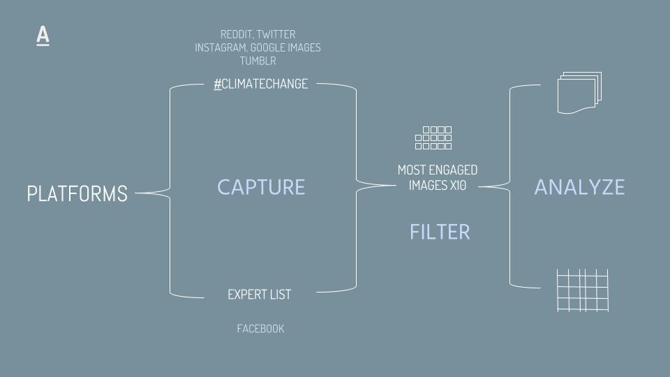
For the creation of the questionnaire every platform group reviewed their data sets to add a list of themes and items for the coding of the images. After a review of all proposed questions, a list of 40 questions containing questions about the contents, form, composition, framing, and sentiment of the images was chosen. A try run was done by coding a image together and tweaking the questions that were unclear or not workable. The images were coded with 3 fixed responses: yes (1), no (2), and unrelated / unidentifiable (0). While the type of enquiry was quantitative in nature, the coding contained to a large degree interpretive responses. Thus, the coding was done both individually and collaboratively through group discussions and double-coding to increase inter-coder reliability.
In addition, composite image stacks were created for the top ten most engaged with images/posts of each platform. This was done on Adobe Photoshop using the following protocol:
-
Stack the images in same order as ranking (when applicable)
-
Centre all images on square
-
20% opacity for each image
-
Layer of saturation 20%
VISUAL OUTPUTS
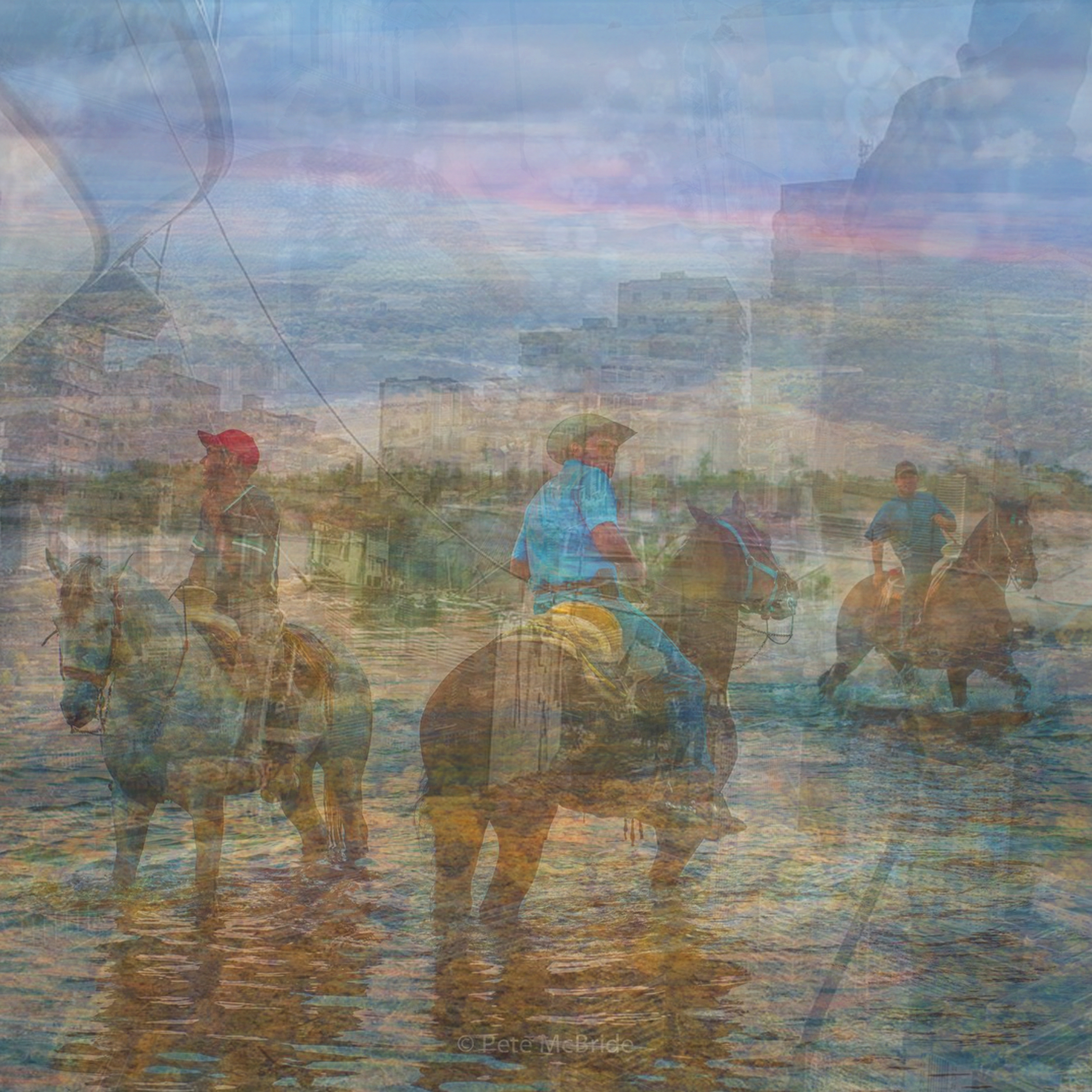
Figure 7. Instagram (stack of top 10 most liked images).
Instagram is a social network built around image and aesthetics, and this is reflected in the image stack: visually engaging and often professionally shot. Also notable here is the absence of any text in the most engaged with images
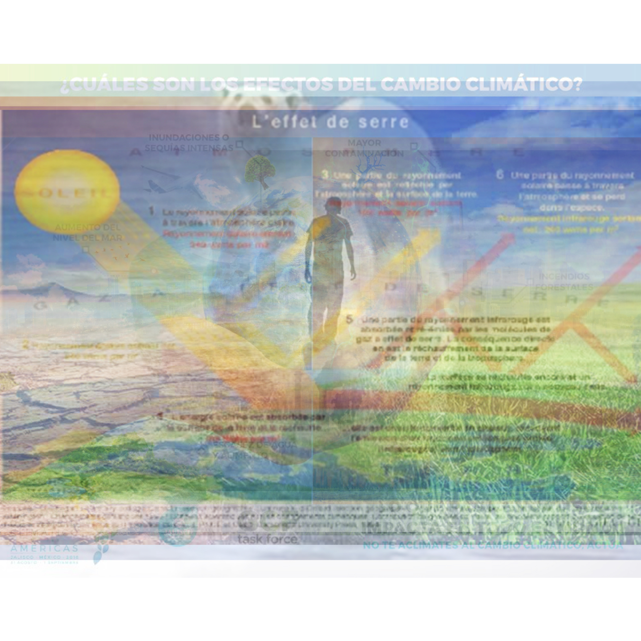
Figure 8. Google (stack of top 10 search results by image)
The images displayed in Google image search for climate change contrast with those in Instagram. Here, the colours are more garish and are more likely to have been adjusted (‘Photoshopped’). Images here are also more likely to conform to the cliched visual language highlighted by Climate Outreach. Visible here are a polar bear image and a picture of the Earth in a human hand. Text is visible on some images, in the form of annotated scientific explainers.
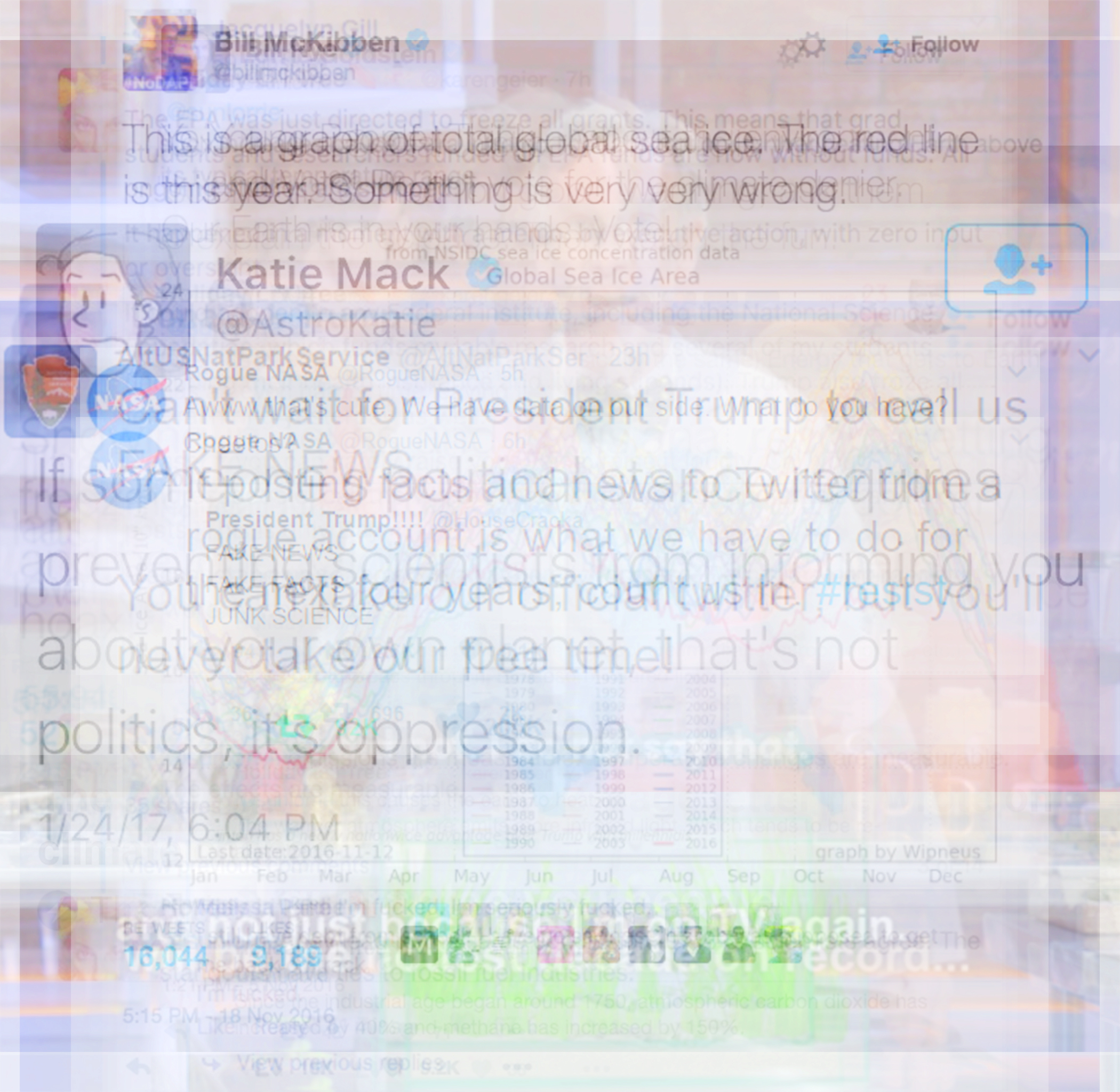
Figure 9. Tumblr (stack of top 10 most engaged with images)
Tumblr provides a surprise in that the image stack looks a lot like the Twitter platform, including a number of screenshotted tweets. This means that text plays an important role in Tumblr imagert. (also visible is a graph of sea ice coverage). In this image stack, Tumblr acts as an unofficial clearing house for repurposed material from other social media platforms.
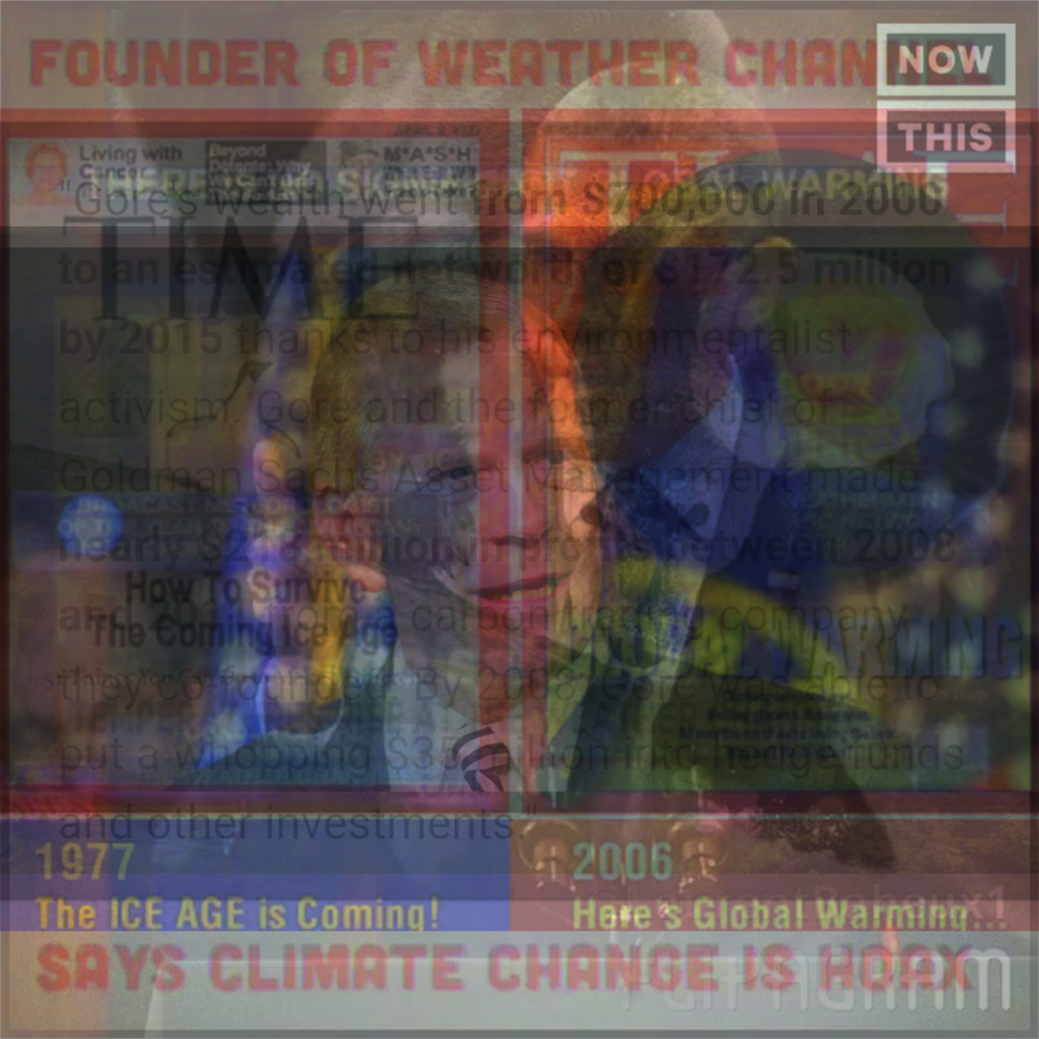
Figure 10. Twitter (stack of top 10 most retweeted images)
The announcement of the US’s withdrawal from the Paris Agreement reanimated controversy around climate change, reflected in this Twitter image stack. Images includes coverage of the Weather Channel’s founder claiming that climate change is a hoax, and screenshotted text making claims regarding Al Gore’s investments in carbon trading. Also visible is the presence of a Time Magazine cover, doctored to claim the coming of a new Ice Age in 1977. This is particularly notable considering that Time Magazine exposed that the cover was a hoax in 2013, yet it still circulates today.
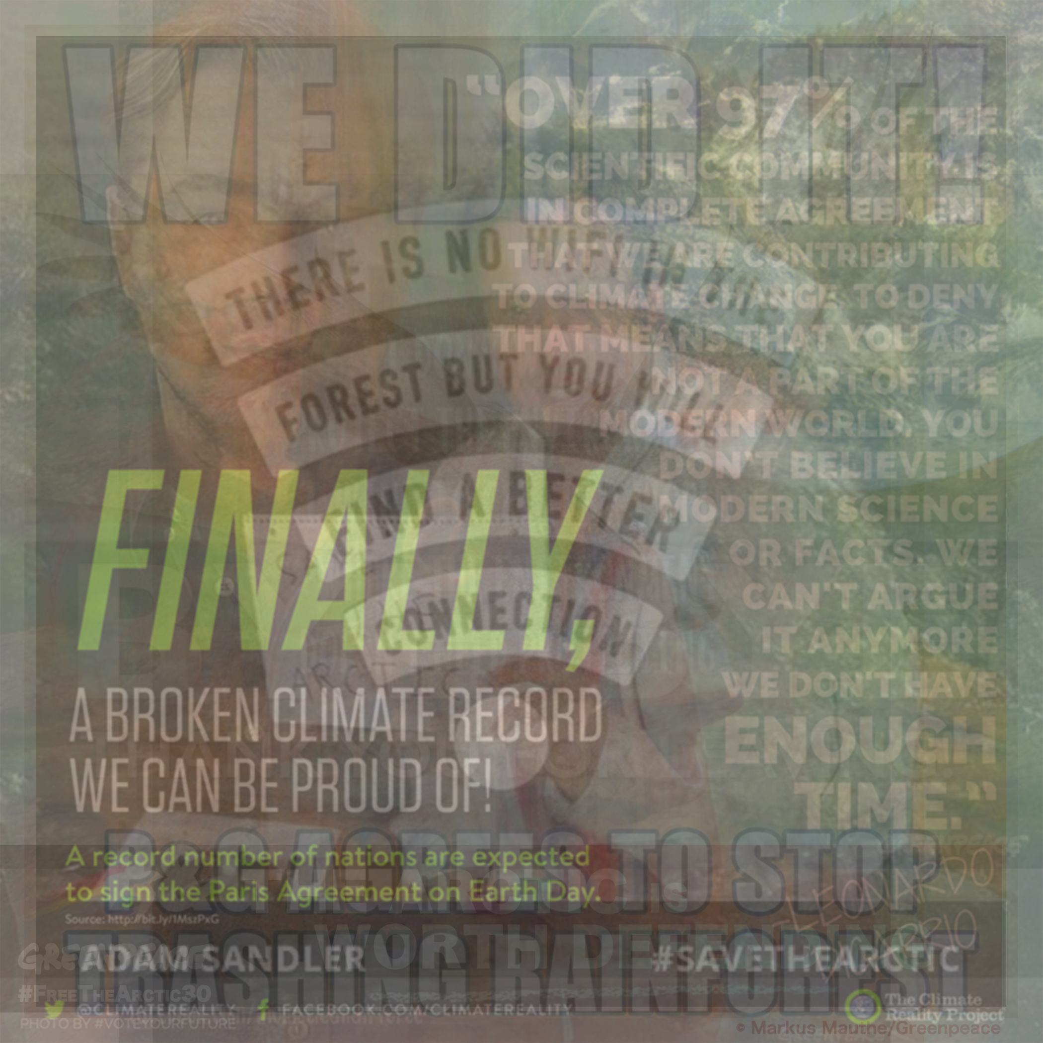
Figure 11. Facebook (stack of top 10 most liked images on pages of selected organisations)
High engagement images on the Facebook pages of climate change organisations are heavily text-based, aiming at memetic or infographic styles. The presence of celebrities Leonardo DiCaprio and Adam Sandler is notable, although this may be as much a consequence of the sample of pages as the Facebook platform itself.
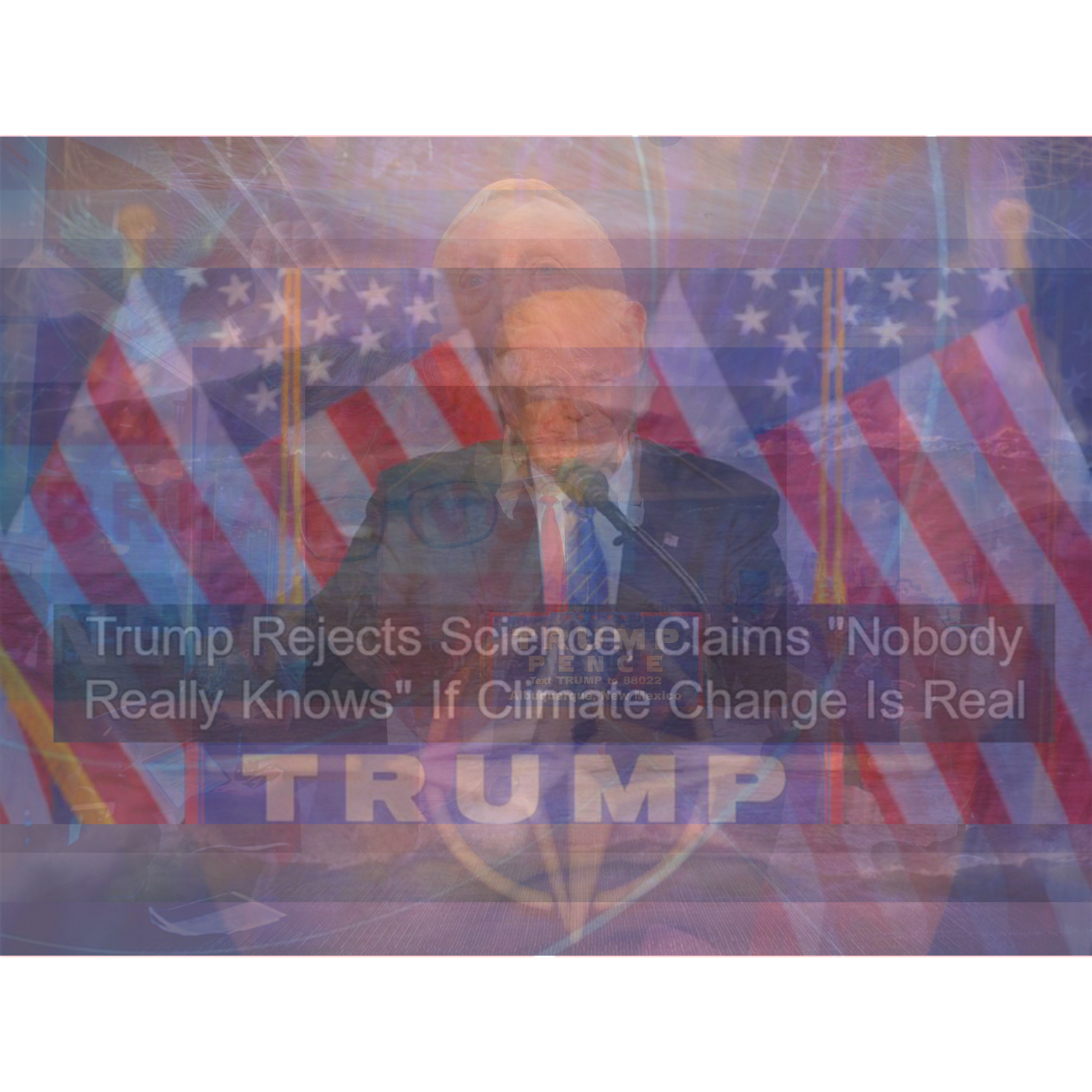
Figure 12. Reddit (stack of top 10 ‘up-voted’ image-based posts on selected subreddits)
Finally, Reddit provides a very different visual vernacular to the other platforms. Here, official staged ‘photo ops’ dominate with politicians, microphones and flags visible. The images are thumbnail ‘cards’ that appear on Reddit when users post the URL to an article. The images appear prominently, to the left of the article title, so can be reasonably assumed to play a role in engagement. However, Reddit differs from other platforms in that the images are not directly uploaded by users. So the visual vernacular of Reddit owes as much to tropes in media coverage of climate change as it does to the behaviour of its users.CONCLUSION
The main finding of this project is that distinct visual vernaculars were present across different social media platforms. Images are an important part of climate change communication, and Climate Outreach’s seven principles provide useful guidance. For social media, it is their final principle “understand your audience” that has particular resonance. We suggest that thinking of social media communication in terms of platform publics acknowledges that social media platforms are diverse in terms of content and style, that these platforms therefore attract distinctive publics, and that these factors need to be considered when communicating climate change (or any other issue) on social media.
Returning to the Climate Outreach report, visual cliches such as smokestacks and polar bears were notable by their absence. Only in Google Image Search were such images prominent, opening up questions regarding how Google ranks image content. In particular, the source pages for the most highly ranked images were varied and often obscure compared to the largely expert pages highly ranked on Google Web Search (NASA, New York Times etc).
We collected a huge amount of images on this project, and there is potential to do a deeper analysis on some of the platforms. In particular, social media image analysis at scale using the Google Vision API provides the potential for a more in-depth comparison between platform vernaculars and the Climate Outreach communication principles. In this wiki report, we have highlighted the production of image stacks as a means of comparison and amplification in visual analysis. Future research will complement this through methodologies that go beyond analysing only the most engaged images to take into account the rich multiplicity of images within social media climate communication, in order to understand distinct publics and clusters that occur within platforms.
REFERENCES
Corner, A., Webster, R., & Teriete, C. (2015). Climate Visuals: Seven principles for visual climate change communication (based on international social research). Oxford: Climate Outreach. http://climateoutreach.org/resources/visual-climate-change-communication/
Gibbs, M., Meese, J., Arnold, M., Nansen, B., & Carter, M. (2015). #Funeral and Instagram: death, social media, and platform vernacular. Information, Communication & Society, 18(3), 255–268. https://doi.org/10.1080/1369118X.2014.987152 Latour, B. (1999). Pandora’s Hope: Essays on the Reality of Science Studies. Cambridge, MA: Harvard University Press.O’Neill, S. J., & Smith, N. (2014). Climate change and visual imagery. Wiley Interdisciplinary Reviews: Climate Change, 5(1), 73–87. https://doi.org/10.1002/wcc.249
Pearce, W., Brown, B., Nerlich, B., & Koteyko, N. (2015). Communicating climate change: conduits, content, and consensus. Wiley Interdisciplinary Reviews: Climate Change, 6(6), 613–626. https://doi.org/10.1002/wcc.366 -- WarrenPearce - 29 Jun 201 *| I | Attachment | Action | Size | Date | Who | Comment |
|---|---|---|---|---|---|---|
| |
Making climate visible.jpg | manage | 28 K | 17 Jul 2017 - 08:48 | NataliaSanchez | |
| |
Van den Dool, Anne - nasaclimatechange Instagram.doc | manage | 957 K | 03 Aug 2017 - 15:35 | WarrenPearce |
 Copyright © by the contributing authors. All material on this collaboration platform is the property of the contributing authors.
 Ideas, requests, problems regarding Foswiki? Send feedback


