"Seeing Data" in a DMI way
team members
Stylianos Moshonas, Nadia Dresscher-Lambertus, Michel Mauri, Gabriele ColomboContext/Inspiration
"Seeing Data" is a project led by dr. Helen Kennedy, University of Leeds, concerned with how people interact with visualisations in their everyday lives, how people talk about visualisation, and whether talk about and engagement with visualisation might enable people to become more engaged in data conversations. The idea in this project was to supplement the approach used in the "Seeing Data" project, which is based on conventional social scientific methods, with digital methods, using two datasets provided by dr. Helen Kennedy. For more information: http://ics.leeds.ac.uk/research/research-projects/seeing-data-are-good-big-data-visualisations-possible/Data sets
The University of Leeds / The "Seeing Data" Research group led by dr. Helen Kennedy provided us with 2 different datasets:- 5000 tweets that were collected with a commercial tool ' BrandWatch ' from March 15 - April 14 2014 and harvested based on the following #dataviz #datavis #infographic #datavisualisation #datavisualization (dataset A)
- Limitation: unfortunately we've discovered that some edges (links) between the Twitter users are missing. Due to the dataset filtering methods (unknown to us) and time restraints for the complete formatting/cleaning of the dataset we couldn't properly reproduce a share/mentioned network.
- A list of URLs for a set of 50 popular datavisualization that trended online. (dataset B)
RQs
*Dataset A: 5000 Tweets* Twitter: RQ 1: What were the most mentioned (and thus most popular) visualizations on Twitter? --> because of dataset formatting problems, we ended up answering a more roboust version of this question: What Urls of visualizations were most present in the data set? Dataset B: 50 Popular Visualization that trended on the Web Facebook: RQ 2: How did the Top 50 visualizations that have trended in recent years online resonate on Facebook in terms of activity (engagement metrics: ranking in 'likes', 'shares' and 'comments')? The Web Here we were interested in perfoming a 'primitive spread analysis', i.e. can we discover certain domains/hosts are most common across the visualizations? RQ 3: If we take all these 50 visualizations together, what domains/hosts play a prominent role in XXX their presence on the Web?Method
Twitter:- Since the data set had formatting issues, we expanded the shortened Urls and ranked how many times they appear in the data set
- We displayed the corresponding data visualizations in order of rank on a pininterest board (see Findings)
- Following the original URLs we identified a list of keywords/title of the visualization for which the first result would bring us to the original link.
- using this set of keywords/title, we queried Google (using the Firefox research browser) for the top 100 results for each visualization.
- For each top 100 results we extracted the URLs using the Harvester tool (settings: only returing uniques and excluding urls from Google and Youtube)
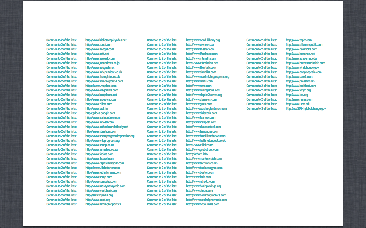
- We then used the Triangulation Tool to compare the 50 lists of Urls for each visualization
- We've plotted the results in a visualization (see Findings)
Findings
Twitter: The top most retweeded and mentioned visualizations are displayed here: http://www.pinterest.com/gabrielecolombo/is-good-big-data-visualization-possible/ Facebook: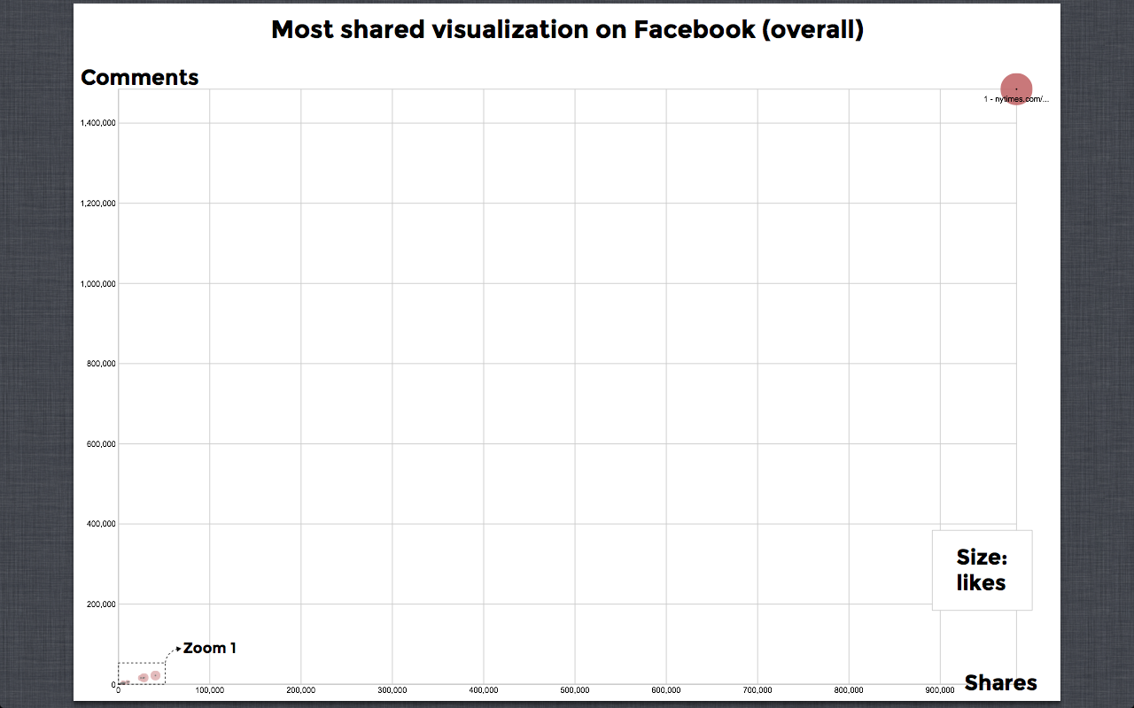
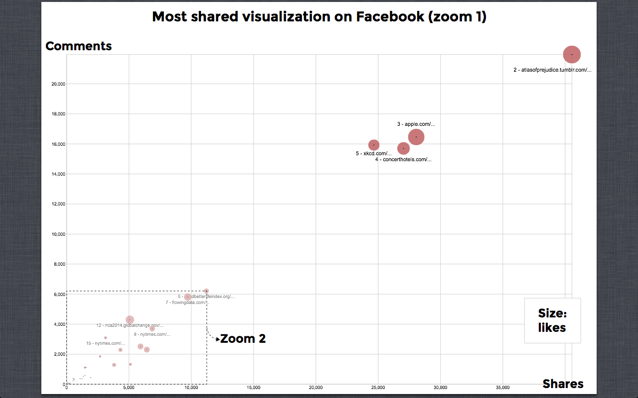
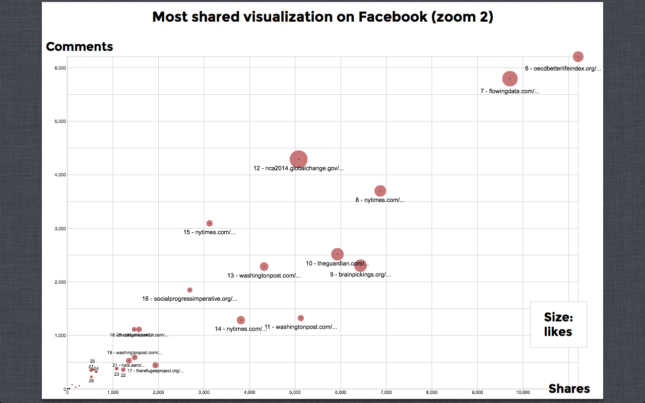 The Web:
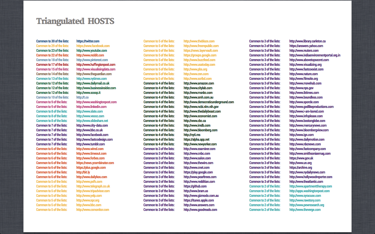
 -- NadiaDresscher - 26 Jun 2014
 | I | Attachment | Action | Size | Date | Who | Comment |
|---|---|---|---|---|---|---|
| |
0.html | manage | 98 K | 27 Jun 2014 - 10:41 | NadiaDresscher | Facebook 1 |
| |
0.png | manage | 279 K | 27 Jun 2014 - 10:49 | NadiaDresscher | Most shared visualization on Facebook (overall) |
| |
1.png | manage | 299 K | 27 Jun 2014 - 10:52 | NadiaDresscher | Most shared visualization on Facebook (zoom 1) |
| |
2.png | manage | 311 K | 27 Jun 2014 - 10:54 | NadiaDresscher | Most shared visualization on Facebook (zoom 2) |
| |
Screen_Shot_2014-06-27_at_3.15.37_PM.png | manage | 630 K | 27 Jun 2014 - 13:36 | NadiaDresscher | |
| |
Screen_Shot_2014-06-27_at_3.15.42_PM.png | manage | 486 K | 27 Jun 2014 - 13:43 | NadiaDresscher |
Edit | Attach | Print version | History: r6 < r5 < r4 < r3 | Backlinks | View wiki text | Edit wiki text | More topic actions
Topic revision: r6 - 27 Jun 2014, NadiaDresscher
 Copyright © by the contributing authors. All material on this collaboration platform is the property of the contributing authors.
 Ideas, requests, problems regarding Foswiki? Send feedback


