One Percent of Twitter, Part II: Geotags, Text Analysis, and Event Profiling
Team members
Lotte Belice Baltussen, Moritz Büchi, Carlo De Gaetano, Lisa Madlberger, Peta Mitchell, Anna Skarpelis, Hanna Stähle, Kristin Van Damme, Fernando van der Vlist
- One Percent of Twitter, Part II: Geotags, Text Analysis, and Event Profiling
- Summary of key findings
- 1. Introduction
- 2. Research questions
- 3. Methodology and methods
- 4. Results and findings
- 5. Discussion and conclusions
- 6. See also
- 7. References
Summary of key findings
- Reconciling various spellings of locations is relatively straightforward for about 50% of the tweets in the sample. Remaining locations either had too little information to disambiguate (e.g. 'Dublin' can be in Ireland or USA), or require additional cultural or contextual understanding (e.g. in the case of DMV).
- In this sample of 1% random tweets, 34% of the users had not specified any location in their profiles.
- A very small percentage of users indicating a location in their profile (.35%) have an imaginary location in their profile (e.g. Hogwarts).
- Using user-set language as proxy for actual language of tweets will result in an overestimation of the number of English-language users.
- User handles are often English-language terms, and will have to be removed from tweet texts prior to running language detection algorithms over them. Otherwise, this to will result in an overestimation of the number of English-language users.
- The top-twitter cities (considering geotagged tweets) are Los Angeles, Rio de Janeiro and Jakarta.
- Users with the language setting English in their user profiles are more likely to use the geotagging feature, users with Japanese language setting are less likely to use geotagging.
1. Introduction
This project is one of the outcomes of the 2014 Digital Methods Summer School, which was devoted to the remote analysis of events. As Twitter changed its byline in 2009 from What are you doing? to Whats happening? it acknowledged a transition in its use and value from an ego-tweeting and ambient friend-following medium to a news and event-following one (Rogers 2013). While most of the recent literature on this relationship between social media (platforms) and events tends to focus on conflicts, disasters, or elections, it raises the question of what an event would look like online, and how one can begin to follow such an event analytically. Rather than trying to ground findings in the offline, we explore what digital methods (Rogers 2013) may contribute to the remote study of events by grounding our findings in the online.
The analytical objectives of this particular project build on those initially explored in Mining One Percent of Twitter: Collections, Baselines, Sampling (Gerlitz and Rieder 2013). Namely, we explore how a (supposedly) random one percent sample of Twitter data may be used for (remote) event and location analysis? What are the methodological affordances of working with such a sample made possible by Twitters Streaming API (Application Programming Interface; see also Borra and Rieder 2014). What does it mean do analysis on geolocation? What would this look like seen from a perspective of location data sent along with digital content and posts on Twitter? Questions of how smaller samples or collections relate to the entirety of activities on Twitter is quite unclear, as well as how the entirety of activities on Twitter relates to the activities not captured on Twitter. Thus, the objective of the research is also to reflect on the different techniques, methods, objects, and devices used by, or as extension of, Twitter for studying culture and society more broadly through repurposing the affordances of the medium itself.
2. Research questions
The overarching objective of this subgroup has been to experiment with different ways of profiling location from social media (geocoded) data, and the kinds of geonarratives it can tell us based on a one percent (supposedly random) sample of tweets, of which again only 1,5% are geotagged. As sceptics, we also ask how biased our selected sample of (random) geotagged tweets is in relation to the whole data set, and by extension how biased the whole data set is in relation to actual society (not everyone is a Twitter user). Three sets of questions guided these experiments:
A. Mapping user-defined locations in relation to geocoded tweets:
- How does the location defined by users in their profiles relate to the locations of their tweets? How can we repurpose these discrepancies in a productive way?
- What non-geographical locations have users set in their profiles, and where do these locations show up according to the Cartesian coordinates provided by tweets?
- Can we identify a relation between devices used and geolocations of tweets?
B. Tracking language:
- Can the language set by the user give us any indication as to the user behaviour? More specifically, is it possible to detect and locate bots from this data?
- How do the language settings of users relate to different devices?
- Frequently, researchers use the user-set language as proxy for actual language used. Occasionally, this then leads to claims (about culture, level of education, mobility, etc.) made on the basis of presumed mono- or bilinguality. But to what extent does the user-set language actually match the practiced language? Are we overestimating the number of English-language users of twitter? With what possible consequences? We will investigate here how the distribution of language differs within a dataset of geotagged tweets, and whether it aligns with national boundaries?
C. Analysing demographics based on geocoded tweets:
- What is the source location of geotagged tweets?
- Which locations are frequently or most often mentioned around the world in different languages, and how does this relate to geolocation?
3. Methodology and methods
A shared dataset was used for the various approaches within the geolocation/text analysis subgroup. The dataset contains a 1% random sample that was captured with the DMI-TCAT (44f403c4a0), focusing specifically on two days worth of lon/lat data: June 2122, 2014.
3.1. Mapping user-defined locations and geocoded tweets
A first analytical approach to the geolocation/text analysis attempted to map locations of geocoded tweets (Figure 4). Through Google Refine's fingerprint keying algorithm, we found out that the set compiles 5,665 clusters of similar locations (e.g. Sao Paulo Brazil, Sao Paulo, Sao Paulo - Brasil), representing 204,879 tweets. These clusters of rows with alternative representations of the same locations were merged in an additional column, where different spellings were merged by using a single unique identifier (e.g. Sao Paulo, Brasil). We have clustered 407 of these key data clusters, representing 173,397 tweets, 84% of the total set. Within this set, empty fields were renamed Empty. This represents 70,039 Tweets, 34% of the total. From our random sample, we identify some problems as well. We observe a general bias towards tweets geolocated in South America, likely due to WorldCup. We also cannot always be sure about the cultural meaning behind text that may signify an actual location (e.g. D[M]V may refer to the renewing of a license, or to a specific location). In some cases, names of places can refer to multiple locations (e.g. Dublin, California and Dublin, Ireland). Ideally, a controlled vocabulary or other algorithmic fingerprinting method to detect clusters of entries that are in fact referring to the same locations.
For the geocoding, we used Google Fusion Tables (http://tables.googlelabs.com/), which offers a feature that will output a map visualisation and .kml file based on spreadsheet data. However, due to character encoding issues, it should also be noted that some locations could not be recognised at all (at least 2440% ambiguous entries), where others are identified on different levels of granularity: ranging from coordinate to city names, states, counties or provinces, countries, or the world. Finally, users used fake locations in their profiles as well, like Hogwarts and Narnia. These were also cleaned and clustered together, in order to map the geolocation of the tweet to its fake location (Figure 5).
3.2. Tracking language
This visualization, created by engineers at Mapbox, an enterprise mapping outfit, in collaboration with Eric Fisher, is an overview of how geography relates to the diffusion of different mobile devices. In this case, the metadata doesn't come from phone calls but from geotagged tweets (three billion of them, since September 2011). We decided to see how this relation behaves from a language perspective, considering language an appropriate geographical indicator.
3.2.1. Language settings
As a first analysis, we counted the number of users for 20 different language settings (ISO-codes: ar, ca, cs, da, de, el, en, es, fr, gl, he, it, ja, ko, no, pt, id, ru, en-gb, tr). We selected the 10 most used and the 10 least used language settings. For each language we then represented the relative number of tweets per user, in order to detect, even for the fringe languages, unusual amounts of tweets per user (which could indicate bot activity). For each language, we then counted the relative device usage, to see any correlation between language devices and language user activity. We created two maps using TileMill (https://www.mapbox.com/tilemill/), showing the geographical diffusion of Instagram and Foursquare source devices.
3.2.2. Language coding and its pitfalls
Frequently, researchers use the user-set language as proxy for actual language used. Occasionally, this then leads to claims about the culture, level of education, mobility, etc. of twitter users, made on the basis of the mono- or bilinguality presumed by presuming that the user-set language accurately reflects the language of daily use of the user. But to what extent does the user-set language actually match the practiced language? And if it doesnt. might we be overestimating the number of English-language users of twitter? With what possible consequences? We will investigate here how the distribution of language differs within a dataset of geotagged tweets, and whether it aligns with national boundaries.
In his visualization of tweets by country, Eric Fischer found a beautiful overlap between language and national boundaries (https://www.flickr.com/photos/walkingsf/6276642489/. We decided to partially replicate his experiment, but create two separate maps so as to juxtapose the detected language of tweets with the language the user sets themselves. The main logistical challenge was simply computational, in that neither LibreOffice nor Google Docs could handle (i.e. open, much less perform operations on) the dataset downloaded from DMI-TCAT, and Google refine couldnt run the language detection algorithm. This meant having to work with excel, which has severe problems with character encoding. As a workaround, we opened the dataset in excel, then copied units of 2,000 tweets each to separate files, saved them as csv's, uploaded them to google docs, ran a language detection algorithm on the tweet text itself , compared the detected language to the user-set language, downloaded the individual files again, merged them in excel and then imported the dataset into mapping software TileMill to visualize the tweets.
3.3. Analysing demographics based on geotagged tweets
An advantage of the 1% random sample is that it preserves the geographic distribution.
With regard to geographic aspects in tweets we investigated (1) where geotagged tweets are sent from, as well as (2) which locations are frequently mentioned in the tweet text, and further explored (3) how representative the sample of geotagged tweets is in comparison to the whole data set.3.3.1. Where are geotagged tweets sent from?
Each geotagged tweet comes with values identifying the origin of a tweet in form of cartesian coordinates (latitude and longitude). In order to be able to create a ranking of tweet locations, we made use of a map projection system, which has originally been developed for military purposes. Using the dataset of geotagged tweets from 16-06-2014 to 22-06-2014 (N=716.172), we used the Military Grid Reference System (MGRS, see: http://en.wikipedia.org/wiki/Military_grid_reference_system) in order to assign each tweet to a 100 x 100km grid on the earth. We retrieved the list of geotagged tweets from DMI-TCAT and performed the conversion with a coordinate conversion Java class ().
Example:
1. Tweet Geotag: Latitude: -26.597692, Longitude -48.987537
2. Conversion to MGRS (22JGR0039756546):
CoordinateConversion cc = new CoordinateConversion();
String utm=cc.latLon2MGRUTM(lat,lng);3. 100x100 Grid cell identifier: 22JGR
3.3.2. Locations mentioned in tweet text
Turning from meta-data based location analyses of Twitter to content, more than 700k tweets with geotags were analyzed with regards to their text, the actual tweet. Using the R software environment (with packages like tm and wordcloud) the text corpus was preprocessed: conversion to all lowercase and removal of stop words and punctuation. The next step was to look at the most frequent words. This revealed that there are many location related terms (cities and countries) in the top 1000 words. The world cup certainly influenced this data, as shown by the frequent mention of participating countries such as Ghana or Argentina.
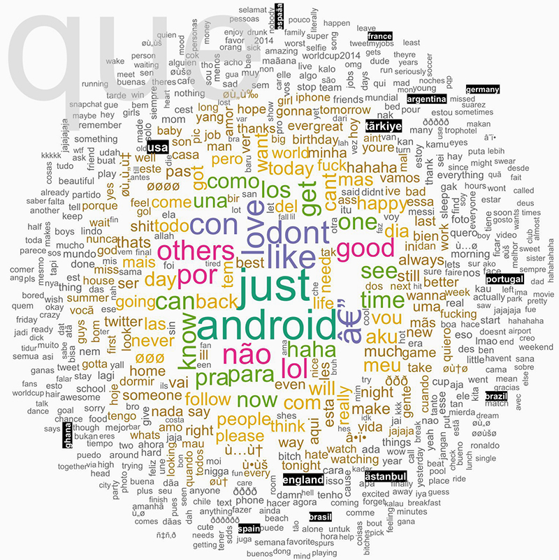
Fig. 1: Word cloud of locations mentioned in tweet text.
The most mentioned location in the tweet dataset was the USA, likely due to its global relevance in various domains. Next is Turkey, which makes sense in light of Turkey's high rate of Twitter usage and current political events the country is prominently mentioned both in English and Turkish despite it not playing in the world cup. Brazil, in its various spellings, on the other hand is produced by the world cup discussions as can be shown in a co-hashtag analysis. Tweets mentioning Brazil have an extremely high probability of directly referencing the world cup. The only cities in the top location references are Istanbul and Jakarta; as both are unrelated to the world cup this highlights their importance for the tweet nations Turkey and Indonesia.
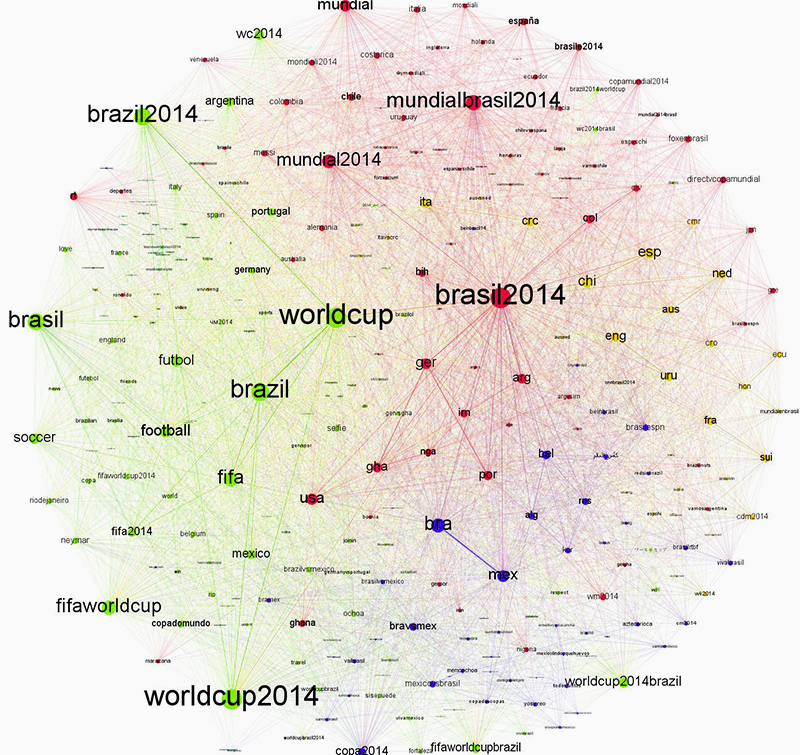
Fig. 2: Co-hashtag graph visualisation showing that Brazil as a theme strongly correlates with discussions around World Cup.
The overlap of tweets originating from a specific location and those mentioning a location is evident, Istanbul is a good example. However, some places were often referred to without being a major source of tweets and vice versa. Japan and Tokyo in particular produce a lot of tweets but were not frequently talked about, which relates directly to the findings below that those people tweeting from a japanese interface are likely to leave geolocation turned off. On the other hand, Portugal as another big Twitter nation geotags an above average amount of tweets while being mentioned probably only as a consequence of the world cup as there are no references to specific cities.
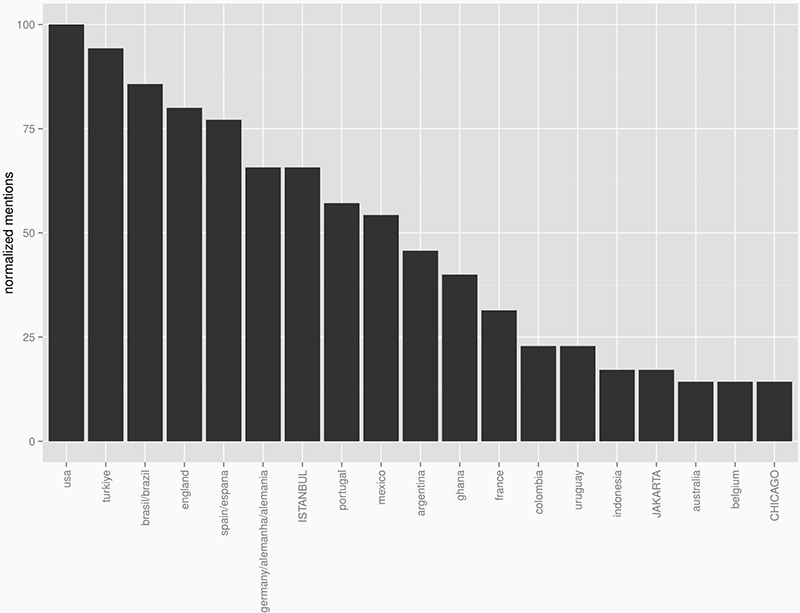
Fig. 3: Bar chart visualisation of location mentions in tweet text.
3.3.3. Representative power of the geotagged subsample
In order to get an approximation whether the sample of geotagged subsample in comparison to the whole 1% sample is similiarly geographically distributed, we analysed the distribution of languages across both samples. One one side we have a sample of 44.648.244 Tweets which the 1% sample including Tweets for 1 week (16-06-2014 until 22-06-2014). On the other hand we filtered from these only those tweets with a valid geolocation tag (i.e. latitude IS NOT 0 OR longitude IS NOT 0). Note that the Analysis Tool T-Cat which captured the tweets inserts lat=0 long=0 for all missing geotags therefore we only consider tweets for which at least one value is not null, as properly geotagged. Strictly seen, by doing that we exclude tweets which are actually sent from location (0,0) which is rather unlikely as this location is in the sea.
We found that English is the most represented language accounting for 45% in the total and 52% in the geotagged one. The big difference between the ratio in the total sample versus the one in the geotagged sample suggest that people indicating english as their language are very likely to switch on the geolocation feature in their profile. The opposite is true for Japanese, as indicated in the table below, Japanese accounts for 19% of all tweets and therefore the second biggest language group in the 1% sample. When looking only at geotagged tweets Japanese is on the 6nd place with only 3% of the geotagged tweets. We can see that the japanese tweets are underepresented in the geotagged tweets suggesting that people with Japanese as their user language are less likely to use the geotagging feature.
Table 1. Language distribution in the geocoded dataset.
| Geotagged Tweets in 1% Sample | 16-06-2014 | 22-06-2014 | 1% Sample | 16-06-2014 | 22-06-2014 | ||
|---|---|---|---|---|---|---|---|
| Language | # of Tweets | Ratio % | Cumulative Ratio % | Language | # of Tweets | Ratio % | Cumulative Ratio % |
| en | 558,220 | 0.52 | 0.52 | en | 20,084,827 | 0.45 | 0.45 |
| es | 153,850 | 0.14 | 0.67 | ja | 8,348,396 | 0.19 | 0.64 |
| pt | 119,811 | 0.11 | 0.78 | es | 5,253,962 | 0.12 | 0.75 |
| tr | 50,736 | 0.05 | 0.83 | pt | 2,374,621 | 0.05 | 0.81 |
| fr | 40,256 | 0.04 | 0.87 | ar | 2,036,495 | 0.05 | 0.85 |
| ja | 36,749 | 0.03 | 0.90 | fr | 1,225,428 | 0.03 | 0.88 |
| id | 33,093 | 0.03 | 0.93 | id | 1,224,758 | 0.03 | 0.91 |
| ru | 20,494 | 0.02 | 0.95 | tr | 1,072,318 | 0.02 | 0.93 |
| ar | 16,313 | 0.02 | 0.97 | ru | 716,398 | 0.02 | 0.95 |
| it | 7,866 | 0.01 | 0.98 | ko | 533,306 | 0.01 | 0.96 |
| nl | 5,266 | 0.00 | 0.98 | th | 379,105 | 0.01 | 0.97 |
| th | 5,246 | 0.00 | 0.99 | en-gb | 368,231 | 0.01 | 0.98 |
| en-gb | 5,169 | 0.00 | 0.99 | it | 290,801 | 0.01 | 0.98 |
| 1,065,352 | 44,648,244 |
3.4. Visualising mobilities
Three use cases have been investigated in order to see the mobility of Tweets over time and in space.
3.4.1. Event-centered visualisation
The selected topic of research was one soccer game of the World Cup 2014, more precisely the game of England versus Uruguay. The motivations to focus on this event are firstly that the world cup is currently a hot topic, since two aspects of the social media platform are combined. Audiences can stay updated about the game and they can interact with the event. People from across the world are engaging with the platform, so the assumption was that mapping these tweets will give interesting results. From a more pragmatic perspective, collecting tweets on the worldcup results in a large sub sample. The percentage of geolocated tweets is (very) low, compared to the whole cluster (in this use case: 2,85%). That specific game was interesting because the end score would define the inclusion and exclusion of the countries playing. Geovisualising the tweets across time shows a slow build-up to the match and a rapid flare of tweets during the match itself.
The starting point of this is the 1% random sample, generated through DMI-TCAT. The query filtered the top 10 mentions related to the world cup, and more specifically the selected game.
This resulted in the following query:
WorldCup OR WorldCup2014 OR EnglandvsUruguay OR Brasil2014 OR URUENG OR URUANG OR URUGUAY OR ComeOnEngland OR FifaWorldCup OR Brazil2014 OR ENGvURU
This then resulted in a file containing 33,880 tweets. From this sample a subsample of 967 geocoded tweet. These were mapped using CartoDB (https://cartodb.com/), a cloud-based tool that maps out geolocations.
3.4.2. Urban location-centered visualisation
The second use case is the mapping of all geotagged tweets sent from one city over the course of two days (2122 June), drawn from the 1% sample. We started by querying DMI-TCAT for all geolocated tweets for the period 2122 June. Those results were filtered according to a geographic bounding box (https://www.flickr.com/places/info/727232) for the Amsterdam metro area. This resulted in 64 geolocated tweets, which were then mapped over time via CartoDB. With a much larger sample (and by combining geotagged tweets with location analysis of non-geotagged tweets), this kind of visualisation (minus the temporal element) could give an at-a-glance understanding of which sites in a city are most likely to be tagged or mentioned. Combined with Flickr, Instagram, and Foursquare data, this could give an insight into a city's cultural imaginary.
3.4.3. User-centred visualisation
The last use case is the visualisation of tweets sent by one user who prolifically uses geotagging. Tracking a Twitter user's physical movements raises serious concerns over privacy and ethics, as the site GeoSocial Footprint (http://geosocialfootprint.com/) makes evident. GeoSocial Footprint, a site that is intended to be used for consciousness raising over privacy and geosocial media, allows a person to enter a Twitter username and see all of that user's geo tweets over their last 200 tweets.
We used GeoSocial Footprint to search for recent geo tweets by Eric Fischer ((@enf), who works for Mapbox (https://www.mapbox.com/). This user is particularly relevant because a substantial percentage of his tweets are geocoded. As a consequence, we can largely put aside ethical and privacy concerns in this case. We felt comfortable in assuming that Fischer a researcher who creates Twitter maps is consciously and deliberately making his location public and is doing so for performative reasons (i.e., letting his followers know exactly where he is while tweeting). We chose a sample day (14 June) with a number of geotagged tweets and mapped these in CartoDB. These tweets show Fischer's movements between Minneapolis and St Paul over the course of a day as he reports on the opening of the new Green Line light rail train linking the two cities. In cases such as this where user privacy is less of a concern, street-level geovisualisation of user tweets can render visible geotweeters performative enactments of movement in and through space and place. These enactments might also be considered, using de Certeau's terminology, spatial stories and pedestrian speech acts.
4. Results and findings
4.1. Mapping user-defined locations and geocoded tweets
As argued by Matthew Zook in a keynote on the occasion of this summer school, the disambiguation and longitude/latitude coordinates found for the locations given by users themselves are not fully trustworthy per se (cf. Crampton et al. 2013). In many cases, for instance, these data do not correspond to the places of the tweets. It is therefore interesting to match the user-defined location fields to those of the geocoded longitude/latitude data associated with each tweet (Figure 4). Ideally, such a visualisation would show the offset of the user-defined location to the geocoded locations per user, and over time to gain insight into mobility patterns for those users. In addition we also prepared a map of locations that refer to fictional or imaginary places, based on the clustered locations data that are also geotagged (June 2122, 2014; Figure 5). Within the total set of 204,879 tweets, 753 locations were identified as fictional or imaginary. As the present map only locates English spelling of e.g. Hogwarts, it would be interesting to add language-specific variations of these fictional places as a basis to create a map of language-specific reading cultures. This might be a way to see in which places particular fictional, imaginary or even ideal places like heaven or paradise have a higher density of occurrence.
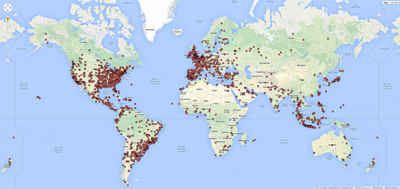
Fig. 4a: World map of user-defined locations for selected dataset.
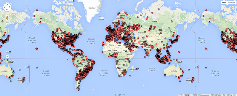
Fig. 4b: World map of geocoded locations of tweets for selected dataset.
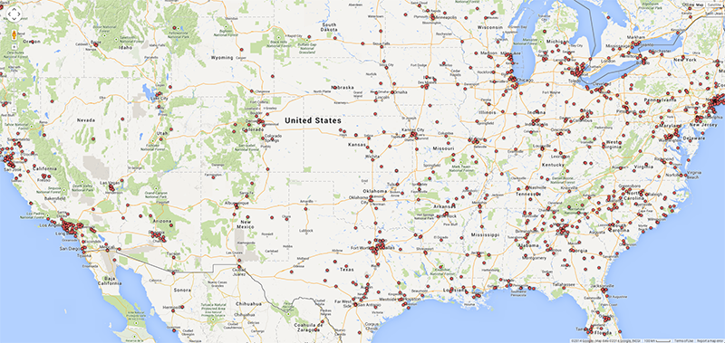
Fig. 4c: User-defined locations for the U.S. in selected dataset.
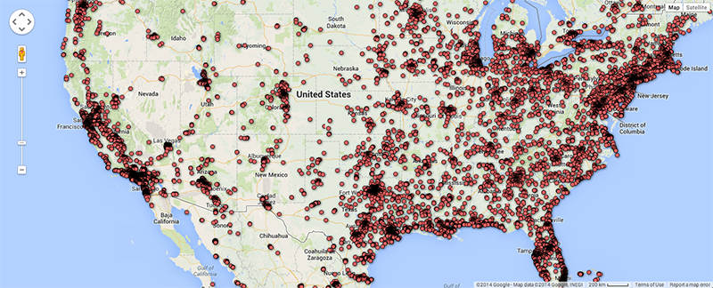
Fig. 4d: Geocoded locations of tweets for the U.S. in selected dataset.
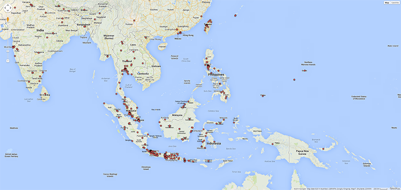
Fig. 4e: User-defined locations for Indonesia in selected dataset.
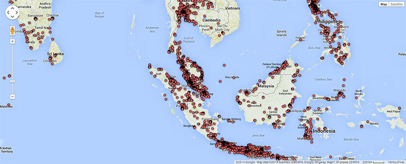
Fig. 4f: Geocoded locations of tweets for Indonesia in selected dataset.
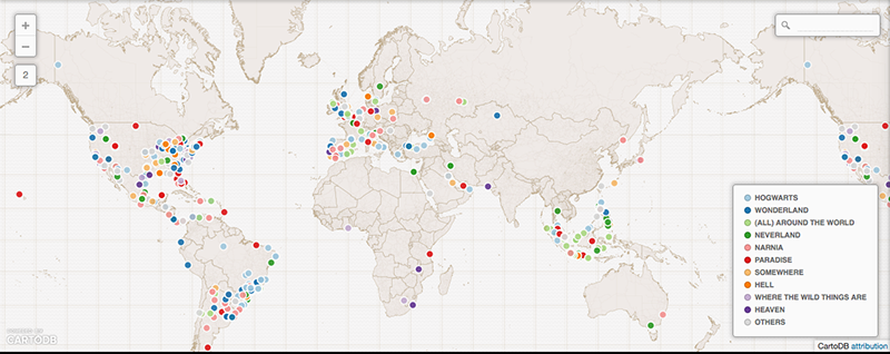
Fig. 5: Map of non-geographical and fictional places located by way of geocoding information in tweets. Interactive map available online: https://lottebelice.cartodb.com/tables/geotagged_imaginary_locations_in_tweep_profile/public/map
4.2. Tracking language
4.2.1. Language settings
The first slide below shows the total number of tweets on a weekend, sorted by the language that the user set (Figure 6a). As expected, English, Spanish and Portuguese were the three most represented language settings. Once one adjusts for tweets by user however, more obscure languages like Galician and Catalan emerge as leaders (Figure 6b). If one looks at follower counts, it emerges that the most active users within those language groups also have the fewest followers, possibly indicating the presence of bots. Overall, iPhone and Android diffusion reflects the research of Fisher, with some particularities: Turkish language has a relevant usage of Instagram and Foursquare devices; Indonesian language doesn't use iPhone as its main device; There are unusual devices that appears related to particular languages, like Sandaysoft Cumulus for Norwegian, or Hora Catalana for Catalan. It was difficult to find a clear relation between bots activity and language settings, due to the dimension of the dataset and the unclear dynamic that rules twitter language settings and devices informations.
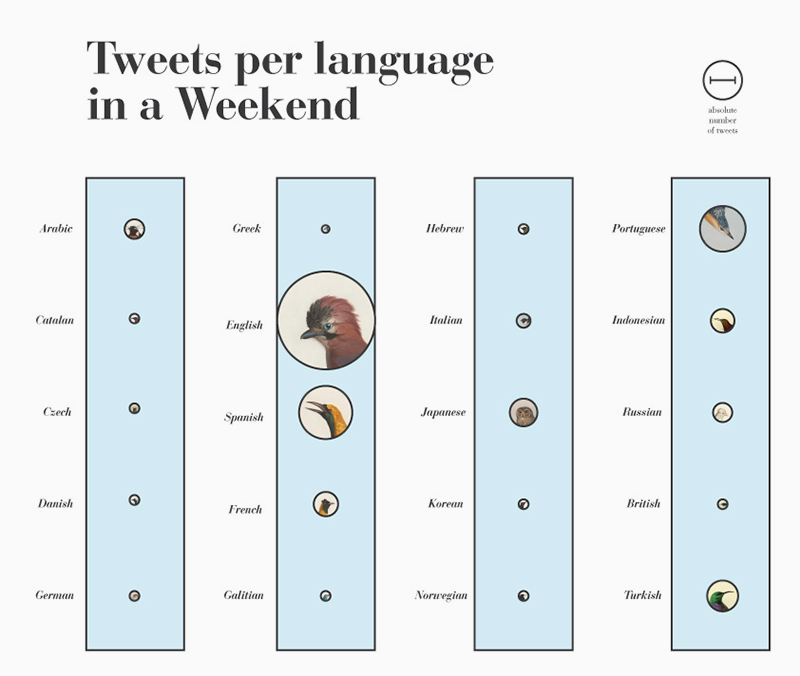
Fig. 6a: Tweets per language in a Weekend for the selected 1% random sample.
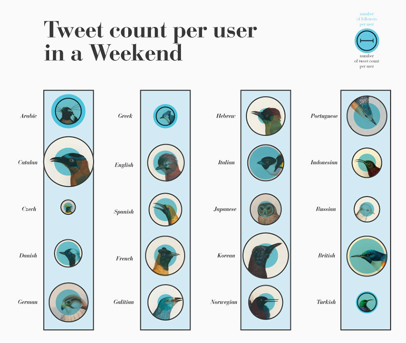
Fig. 6b: Tweet count per user in a Weekend for the selected 1% random sample.
4.2.2. Language coding and its pitfalls
What we found when looking at user-set language, was that the language people set frequently matches the majority language of the country they tweet from. So far, the results matched those of Eric Fischer. There was a slight bias in that when people deviated from the language used in the country they signed up in, they choose English [see figure 4 below, Languages by Tweet]. For example, Indonesians frequently set their user language to English. But when one looks at the actual language of tweets, these were frequently done in Indonesian (see figure 5 below, Languages by Tweet: Detected Language).
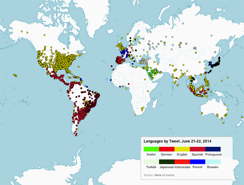
Fig. 7a: Languages by tweets based on the user-defined location fields.
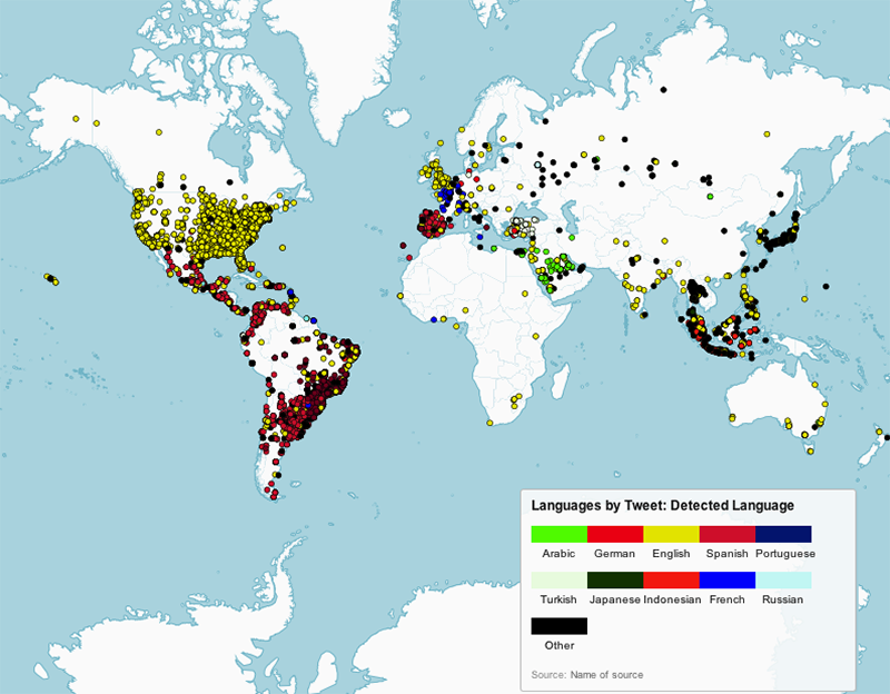
Fig. 7b: Languages by tweets based on detected tweet language.
4.3. Analysing demographics based on geotagged tweets
By assigning a Grid cell identifier to each of the tweets we could identify the cells where most tweets originating from. By transforming the codes in MGRS-code back to cartesian coordinates we could identify the metropolitan area covered by a particular cell, resulting in a list of top 20 cities where most of the geotagged tweets are sent from.
Table 2. Top Twitter cities based on geotagged tweets.
| UTM Block | Longitude | Latitude | # of Tweets | Region | Country |
|---|---|---|---|---|---|
| 11SLT | -119.1510327 | 33.42071926 | 14,000 | Los Angeles | US |
| 23KPQ | -42.73382755 | -23.29780949 | 13,542 | Rio de Janeiro | BR |
| 48MXU | 113.1698092 | -6.315905066 | 13,434 | Jakarta | ID |
| 35TPF | 28.18269962 | 40.64479787 | 12,405 | Istanbul | TR |
| 23KLP | -49.36823354 | -24.24123993 | 11,825 | Sao Paolo | BR |
| 21HUB | -59.24836928 | -52.97510785 | 11,574 | Buenos Aires | AR |
| 31UDQ | 1.639720754 | 48.7449812 | 9,613 | Paris | FR |
| 18TWL | -75 | 40.65085652 | 8,398 | New York | US |
| 48MYT | 119.1084121 | -7.374468104 | 6,909 | Bandung | ID |
| 54SUE | 139.1195802 | 17.17604085 | 6,612 | Tokyo | JP |
| 51PTS | 120.2173707 | 14.4561651 | 6,570 | Manila | PH |
| 53SNU | 135 | 34.34130272 | 5,644 | Kyoto Osaka | JP |
| 47PPR | 99.92426372 | 13.56673996 | 5,539 | Bangkok | TH |
| 47NQD | 100.7990562 | 2.712827762 | 5,276 | Kuala Lumpur | MY |
| 30UWE | -3 | 35.24307771 | 5,128 | Liverpool, Manchester | UK |
| 18SUJ | -76.92143665 | 20.78911187 | 4,769 | Washington, DC | US |
| 30UXC | -1.924235961 | 33.43472762 | 4,604 | Bristol, Oxford, London | UK |
| 16TDM | -88.19896629 | 41.54541179 | 4,581 | Chicago | US |
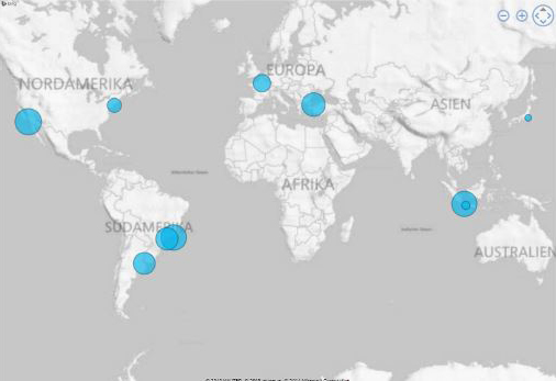
Fig. 8: Top-10 Twitter cities.
4.4. Visualising mobilities
4.4.1. Event-centered visualisation
Fig. 9: Geotemporal visualisation of all geotagged tweets about the World Cup from 1% sample on 19 June (tweet count: 967).
Results show that throughout the day tweets have been sent on the World Cup. In line with the expectations, a spike is noticeable in the two competing countries during the time of the actual game.
4.4.2. Location-centered visualisation
Fig. 10: Geotemporal visualisation of geotagged tweets in Amsterdam on 21 and 22 June 2014 (tweet count: 64).
4.4.3. User-centred visualisation
Fig. 11: Visualisation of geotagged tweets by user @enf on 14 June 2014 (tweet count: 8).
5. Discussion and conclusions
While comparing locations indicated by users in their profiles versus the geolocations of their tweets, we encountered various issues. First of all, automatically running longitude/latitude coordinate analysis on the user-specified locations revealed that there is a high degree of ambiguity (between 20%40%). While doing the long/lat analysis by hand, this percentage was greatly reduced, by also checking the geolocations of the tweets and reading the user profiles (e.g. Dublin is both a location in Ireland and California, and only the context of the user information revealed this). Secondly, we found that a small group of users (only around 800 in our set of 200,000 geocoded tweets) use imaginary locations like Heaven and Hogwarts. It would be interesting to add language-specific variations of these fictional places as a basis to create a map of language-specific reading cultures. This might be a way to see in which places particular fictional, imaginary or even ideal places like heaven or paradise are more likely to occur.
Very broadly, the above findings for tracking language suggest that if one is trying to approximate language by analyzing the user-set language field in tweets, this will lead to an overrepresentation of English-language users and tweets. Anyone attempting to make claims about user characteristics and behaviours by language should be mindful of this.
There are two further complications. First, the language detection software cannot distinguish between tweet text and user handle terms. Seeing that frequently the handles are English terms, and that the text is often written in colloquial English or vernacular, the language detection algorithm if in doubt categorized a tweet in English when in fact it wasnt English. A second complication is that excel garbled the characters of the tweets, with the strange pattern of turning Russian, Thai and Arabic texts into Japanese (insidiously, both katakana and Kanji). At the same time, Japanese text was garbled into a variety of other scripts. This meant that language detection was impossible on these languages and had to be done by hand. Due to time constraints, this was not fully represented in the maps. For future attempts at language detection, we will implement this language detection algorithm.
We presented a simple approach to analyze the geographic distribution of geotagged tweets. For the 1% between June 16 and June 22 2014, we found that most tweets originate from big metropolitan areas like Los Angeles, Rio de Janeiro or Jakarta. It seems that twitter is popular in both the eastern and the western worlds with the top 10 cities being located in the North and South America, Europe, and Asia.
Finally, conclusions for visualising mobilities can be done at different scales in order to answer different research questions. The user-level scale, while it can provide rich information about an individuals movement through space and time, raises serious questions about ethics and privacy, which nonetheless also apply at other levels of geovisualisation.
6. See also
The above has been presented at the Digital Methods Summer School. The slides of this presentation are available online: https://drive.google.com/file/d/0B7kauqMahX-2TS1ySGZZbnRzLWM.
7. References
Borra, Erik K., and Bernhard Rieder. Programmed Method: Developing a Toolset for Capturing and Analyzing Tweets. Aslib Journal of Information Management 66.3 (2014): 262278. Print.
Crampton, Jeremy W. et al. Beyond the Geotag: Situating Big Data and Leveraging the Potential of the Geoweb. Cartography and Geographic Information Science 40.2 (2013): 130139. Print.
Gerlitz, Carolin, and Bernhard Rieder. Mining One Percent of Twitter: Collections, Baselines, Sampling. M/C Journal 16.2 (2013): n. pag. Web. <http://journal.media-culture.org.au/index.php/mcjournal/article/viewArticle/620/0>.
Graham, Mark, Scott A. Hale, and Devin Gaffney. Where in the World are You?: Geolocation and Language Identification in Twitter. Professional Geographer (forthcoming). <http://arxiv.org/pdf/1308.0683.pdf>.
Leetaru, Kalev H., Shaowen Wang, Guofeng Cao, Anand Padmanabhan, and Eric Shook. Mapping the Global Twitter Heartbeat: The Geography of Twitter. First Monday 18.5 (2013): n. pag. Web. <http://firstmonday.org/ojs/index.php/fm/article/view/4366/3654>.
Rogers, Richard A. Debanalizing Twitter: The Transformation of an Object of Study. Proceedings of the 5th Annual ACM Web Science Conference (WebSci 13)(2013): 356365. Print.
. Digital Methods. Cambridge, MA: The MIT Press, 2013. Print.
Weller, Katrin, Axel Bruns, Jean Burgess, Merja Mahrt, and Cornelius Puschmann, eds. Twitter and Society. New York: Peter Lang, 2013. Digital Formations.
 Copyright © by the contributing authors. All material on this collaboration platform is the property of the contributing authors.
 Ideas, requests, problems regarding Foswiki? Send feedback


