Crawling the italian Green Pass debate on Twitter
Team Members
Abdourahmane Tintou Kamara, Annick Vignes, Auriane Polleau, Aurore Deschamps, Chiara Caputo, Christophe Prieur, Claudia Egher, Dylan Cubizolles, Enguerrand Armanet, Federico Lucifora, Hajar Laglil, Marilù Miotto, Raphael Delivre, Sébastien Tadiello, Sila Tuncer, Simone Persico, Tom Billard, Valentin Chabaux, Zakaria Tahiri.Contents
1. Introduction
The last Censis report[1] about the social situation in Italy highlighted that the number of people adhering to irrational thoughts is increasing and that this could be related to the pandemic situation. The term irrational describe the situation where people become victim of cognitive biases that could led them to wrong interpretations and conduct to conspiracy theories[2]. Social Networks are nowadays platforms that lot of users use to directly find informations about social interest topics and doing so they can be influenced by the contents that other people shares [3]. Twitter is a space where common people, VIPs, politics and journalists debate about actuality topics and sometime can become an highly polarizing environment. In Italy one of the most divisive topics since his institution in the middle of July has been the covid-19 certificate (commonly known as “green pass”). The purpose of the project is to explore and classify the most polarizing contents surrounding this debate, particularly focusing on the external sources of informations shared into the platform. A list of source domains will be crawled to map the network, in order to find links that can be used as sign of homophily between sources. The position into the debate will be evaluated according to proximity to known sources of information, previously labelled as “mainstream” or “not mainstream” with the aim of revealing the possible presence of platforms related to conspiracies in the sources far from mainstream media.3. Research Questions
The main question is: Do the mainstream media resist to complotist websites? The purpose is to use the green pass debate in Italy as a case study to investigate the network of URLs shared on tweets. The goal is to find out more about information sources and to measure a possible contamination of mainstream media by complotist sites over time.4. Methodology and initial datasets
The original dataset contains more than 5M tweets captured via Twitter API v.2. The choice of the keyword has been suggested listening to the public debate where both common people than journalists and politicians use the common definition “green pass” to refer to what is legally and officially called “certificazione verde”. So we included both keywords ‘greenpass’, ‘green pass’ and later we add a third keyword ‘supergreenpass’ that is the common definition used starting from December to distinguish between a green pass obtained trough covid-test or a supergreenpass obtained trough vaccination. The period we focused on starts from June 15th to December 14th 2021. This period allowed to monitor the initial raise of the debate in the platform (the green pass has been announced on July 22nd) and also peaks of discussion around particular topics that fueled the public debate (protest march, green pass mandatory for work, supergreenpass). The Data has been collected using 4CAT and then migrated to TCAT where a language filter has been applied selecting 4.317.034 tweets in Italian language to better focus on the italian debate. The filter have also deleted some noise due to English language where the words “green” and “pass” can be used in different contexts. A specific entity we focused on have been the links shared on the platform. TCAT’s Url expander has been able to correctly translate 73’798 unique Urls (the 95,77%), while the remaining 4,23% was unfortunately made by bad Urls (3’124).
 4.1 Macro approach
4.1.1. Looking at the network of shared URLs with Cortex
In order to study the link between network users (from__user_name) and websites (domains), we used “ Network Mappingg '' in Cortext Manager. It produces several types of analysis and visualizations. The maps feature homogeneous or heterogeneous nodes which can be linked according to different types of proximity measures. Then, we will be representing the “domains” geographically using “Geospatial Exploration” in cortext.The first step is to select which field contains the geographical coordinates (Use a custom longitude|latitude field). This field is produced by CorText Geocoding service as geo_longitude_latitude which is selected by default. Our next step will be to identify the 10 most mentioned websites target/source (cf 5.1.2.2 ). Once we have our top list, we will be doing a “ Network Mapping '' but this time just for the targeted websites. Then, we will be studying the correlation between these two fields : network users (from__user_name) and websites (domains). For this purpose, we will be using “ Profiling” in Cortext Manager. Given two fields of interest, it will consider a target entity in the first field and produce a visualization of how biased the entities of the second field are distributed in documents which have been tagged by this target entity.
4.1.2. Crawling the shared URLs to expand the network
4.1.2.1. Using Python
In parallel to this we started to design a script allowing the concatenation of the DataFrame into a single csv/zip file. This script was shared with the team. Then, we created a script to scrape URLs with the 'BeautifulSoup' library. We had a lot of difficulties at the beginning, it took us a day to design a working script. We had never scraped with python before and never used try & except to pass format errors in our datasets. After a succession of attempts and group work, we understand that to create an efficient and shareable code we have to be clearer in the variables we define ('scrapUrl' instead of 'b') put annotations on the program's functioning and above all write the code with functions and not in concatenated form! The code is therefore functional but finally not used because other teams have reached the same goal with the hyphe software. Following this we have created a script allowing us to cut in a week the DataFrame, this script was rather quickly functional and shared. Then, we started to create a dictionary to avoid scraping the same URLs several times, in order to optimize the previous process.
4.1.2.2. Using Hyphe
By focusing on hyperlinks, we wanted to create a visualization which shows their evolution. For this, it was necessary to realize a crawling on Hyphe in order to obtain the urls linked to those present in the database and then make a visualization on Gephi. Based on the initial dataset, we used python to count the unique occurrences of the websites’ domains. We cleaned them and selected the 400 most cited domains. We imported these 400 domains into Hyphe and we selected a crawling depth of 1 to retrieve only the websites that are directly linked to the domains to crawl. We downloaded the resulting network in gephi and csv format. We then did a second, more comprehensive crawling. From the general dataset, we extracted the domains cited by at least 10 tweets during the period (3000 out of 8500). The network nodes were exported so that we could have a network of direct links between these sites.
4.1.3. Classifying websites in mainstream / non-mainstream media
The main goal is to label the shared URLs of our dataset in media categories to then look at their influence in the network. To label the domains, we used several lists with categories. First, we have a list of "mainstream" media established by hand based on some group member's experience of Italian media. Then, we have a list of mainstream media, split into 8 categories. This list of non-mainstream media is based on the site The Black List: La lista nera del web. We scrapped the information from this page in the form of a python dictionary that classifies the sites / web pages according to the following categories, in Italian, then mapped in English. After reuniting the two lists in one unified format and cleaning them, we use them to label the dataset of URLs. Each URLs was attributed none, one, or several categories, if the domain fell into none, one, or several of the defined categories.
4.1.4. Construction of a proximity score
The goal of the proximity score was to look at the way mainstream and non-mainstream websites structure the network of shared and crawled URLs. Moreover, we aim to look at the evolution of this proximity score in the network over the studied period. Due to limited technical, human, and time resources, we wanted to keep the first iteration of the score as simple as possible. Thus, we decide to look at all the websites that are themselves labeled and those that are at distance 1 from a labeled domain. We take into account with the same weight the domains quoted by non-mainstream sites and sites that quote non-mainstream domains. Similarly, quoting or being quoted by a mainstream and non-mainstream site has the same intensity. We defined a function to calculate the score for each category of media, for a specific network. To calculate the score week by week, we use weekly networks of the cited URLs.
5. Findings
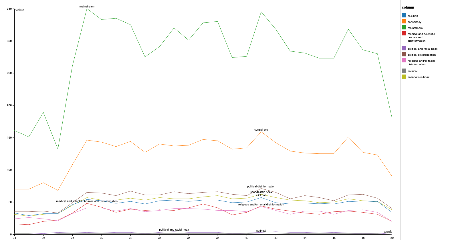
Dominant voices week by week:
4.1 Macro approach
4.1.1. Looking at the network of shared URLs with Cortex
In order to study the link between network users (from__user_name) and websites (domains), we used “ Network Mappingg '' in Cortext Manager. It produces several types of analysis and visualizations. The maps feature homogeneous or heterogeneous nodes which can be linked according to different types of proximity measures. Then, we will be representing the “domains” geographically using “Geospatial Exploration” in cortext.The first step is to select which field contains the geographical coordinates (Use a custom longitude|latitude field). This field is produced by CorText Geocoding service as geo_longitude_latitude which is selected by default. Our next step will be to identify the 10 most mentioned websites target/source (cf 5.1.2.2 ). Once we have our top list, we will be doing a “ Network Mapping '' but this time just for the targeted websites. Then, we will be studying the correlation between these two fields : network users (from__user_name) and websites (domains). For this purpose, we will be using “ Profiling” in Cortext Manager. Given two fields of interest, it will consider a target entity in the first field and produce a visualization of how biased the entities of the second field are distributed in documents which have been tagged by this target entity.
4.1.2. Crawling the shared URLs to expand the network
4.1.2.1. Using Python
In parallel to this we started to design a script allowing the concatenation of the DataFrame into a single csv/zip file. This script was shared with the team. Then, we created a script to scrape URLs with the 'BeautifulSoup' library. We had a lot of difficulties at the beginning, it took us a day to design a working script. We had never scraped with python before and never used try & except to pass format errors in our datasets. After a succession of attempts and group work, we understand that to create an efficient and shareable code we have to be clearer in the variables we define ('scrapUrl' instead of 'b') put annotations on the program's functioning and above all write the code with functions and not in concatenated form! The code is therefore functional but finally not used because other teams have reached the same goal with the hyphe software. Following this we have created a script allowing us to cut in a week the DataFrame, this script was rather quickly functional and shared. Then, we started to create a dictionary to avoid scraping the same URLs several times, in order to optimize the previous process.
4.1.2.2. Using Hyphe
By focusing on hyperlinks, we wanted to create a visualization which shows their evolution. For this, it was necessary to realize a crawling on Hyphe in order to obtain the urls linked to those present in the database and then make a visualization on Gephi. Based on the initial dataset, we used python to count the unique occurrences of the websites’ domains. We cleaned them and selected the 400 most cited domains. We imported these 400 domains into Hyphe and we selected a crawling depth of 1 to retrieve only the websites that are directly linked to the domains to crawl. We downloaded the resulting network in gephi and csv format. We then did a second, more comprehensive crawling. From the general dataset, we extracted the domains cited by at least 10 tweets during the period (3000 out of 8500). The network nodes were exported so that we could have a network of direct links between these sites.
4.1.3. Classifying websites in mainstream / non-mainstream media
The main goal is to label the shared URLs of our dataset in media categories to then look at their influence in the network. To label the domains, we used several lists with categories. First, we have a list of "mainstream" media established by hand based on some group member's experience of Italian media. Then, we have a list of mainstream media, split into 8 categories. This list of non-mainstream media is based on the site The Black List: La lista nera del web. We scrapped the information from this page in the form of a python dictionary that classifies the sites / web pages according to the following categories, in Italian, then mapped in English. After reuniting the two lists in one unified format and cleaning them, we use them to label the dataset of URLs. Each URLs was attributed none, one, or several categories, if the domain fell into none, one, or several of the defined categories.
4.1.4. Construction of a proximity score
The goal of the proximity score was to look at the way mainstream and non-mainstream websites structure the network of shared and crawled URLs. Moreover, we aim to look at the evolution of this proximity score in the network over the studied period. Due to limited technical, human, and time resources, we wanted to keep the first iteration of the score as simple as possible. Thus, we decide to look at all the websites that are themselves labeled and those that are at distance 1 from a labeled domain. We take into account with the same weight the domains quoted by non-mainstream sites and sites that quote non-mainstream domains. Similarly, quoting or being quoted by a mainstream and non-mainstream site has the same intensity. We defined a function to calculate the score for each category of media, for a specific network. To calculate the score week by week, we use weekly networks of the cited URLs.
5. Findings
Dominant voices week by week:

Here we can observe the evolution of the dominant websites among twitter corpus, namely the domains that have been the most shared. This type of graph allows us to monitor the evolution of how and when a website can be prevalent in the debate. The evolution week-by-week shows the prevalence of mainstream media as dominant voices at the beginning of the debate in June (Corriere, Ansa, LaVerità) with the situation that changes during August when is clearly observable the rise of Byoblu (conspiracy-related platform) and ImolaOggi (related to fake news and misinformation). Their presence in the debate remains quite constant during all the period took into account. Another feature is the presence of bridges to Youtube that cansuggest further investigation to bridges directed to other Social Networking sites.
In this network analysis of the in-out URLs, and ordinarily enough, the non-mainstream media are never directly connected to mainstream media except through a proxy (ie. class other URLs). The clickbait class is categorized by blogs. A type of simple and free to use web publication system. This class in particular has direct and greater connections with the conspiracy class. In terms of this latter, it is dominated by social network groups and pages like Facebook or Twitter. It is clear that the concentration of the conspiracy class is strictly tied to Luogocomune, making it the greatest culprit in this category. The mainstream media has built a solid barrier against the other misleading media that can potentially relay fake news. It has done a successful job considering the data we have and the classification we could rely on. However with so many classes not categorized because of the shortage of information, we were unable to go beyond the assumption that these types of unknown/unclassified media are trustworthy enough to be directly targeted by the mainstream category, and to redirect once more to another non-mainstream outlet… Which asks the question as to who defines the threshold of trustworthiness.
Distance score analysis:
The histogram shows the evolution over time (week-by-week) of the number of websites at distance 1 from mainstream/not-mainstream media. The proximity score is based on the concept of homophily and is calculated based on the distance to known mainstream/non-mainstream websites previously labelled. Is evident that mainstream and not-mainstream websites loosely follow the number of tweets per week but another noticeable aspect is the proportion of mainstream/non-mainstream that appear to be constant over time. This particular may suggests that mainstream media are “resisting” well to non-mainstream media activity.
Byoblu Ego Networks
Having identified Byoblu as one of the main not-mainstream dominant voices we decided to focus on the correlation between Users and Domain studying his Ego-network during 4 critical-periods. The 1st and 2nd frames refers to just before (1 to 12 July) and after (20 to 27 July) the GreenPass announcement on the 22nd July. The third frame (29 Sept to 08 Oct) has been taken to observe the network in a period of relative quiet around the topic, just before the extention of the GreenPass for work.Finally, the 4th frame (17 to 29 November) refers to the announcement of the so-called SuperGreenPass (a distinction between GP obtained with covid-test and SGP obtained trough vaccination). The Ego-Network has been taken with a depth of 3 in order to include that domains shared by users that have also shared Byoblu links. The dimension of the label is proportional to the number of users that have shared the correspondant source. What we can see is that before the debate arose Byoblu network was pretty small, and started raising toghether with the first peak in later July. Comparing the 3 frames with more data it looks like during the quiet period Byoblu has more weight into the debate (expecially among non-mainstream media) and looks connected with more other fake-news-related sites. What probably happens is that during the peaks, the rise of the debate makes more mainstream media focused on the topic, causing a decrease of the relief and importance of Byoblu that, on the other hand, happears to be constantly focused on the debate. This is highlighted comparing the 2nd and 3rd frames: they are both 8 days periods and have quite the same number of nodes (users and domains), the difference is that in the 3rd frame, Byoblu ego-network represent the 13.53% of the network, while dutring the 2nd frame it decrease to a 6.09%. Taking a depth of 1, and considering so only the users directly related to Byoblu the result looks the same. These data seems to support the hypothesis that the increased influence of Byoblu (and probably other fake news media) is due to the lack of coverage of the topic by the mainstream media in period when there is not much actual news to report about it. It also suggests that there are different ways in which mainstream vs. polarized media select the topics they engage with and the level of coverage they ascribe to them. Our findings suggest that highly polarized media might be making more efforts to maintain certain issues alive and in the attention of their audience. Alternatively, it may be that such tactics are deployed in order to retain audiences with particular tastes in regard to news they find interesting.
6. Discussion
The main hypothesis of this study is based upon a distinction between mainstream and non-mainstream media and the navigation of interactions between these two poles by conspirationist tendencies. Initially, this premise puts forward a necessity to discuss the definition of the mainstream media, yet different definitions of the mainstream media or a conspirationist content might lead us to different results. Hence, a prior discussion of these conceptions is required in order to demarcate the position of researchers towards their study. Furthermore, considering these two types of media as two isolated entireties may also be a biased approach to the question. J.Rauch suggests in their article about the relationships between alternative and mainstream media that "Academics largely reject the alternative–mainstream dichotomy and view these media on a continuum, featuring many hybrids and few pure instances." 1 . In our study, we don't use the term alternative to qualify the opposite of a mainstream media, but it is still possible to recapture this rejection as a conceptual but also a methodological discussion. In addition, as stated by Richard Rogers (2020) with the example of fake news on twitter, the size of the issue largely depends on the classification 2 . Indeed, a stricter classification rule will most likely result in a less visible issue. This emphasizes the importance of methodological choices in the media classification. Concerning the media classification, the method pursued by our team is based on a distinction of Italian media. As explained previously, a list of non-mainstream media shared on an Italian website is taken as a reference point. In that way, relying the study on a source shared on a website evokes a methodological bias as the source might generate objectivity. However, as most of the group didn’t speak Italian, and we had a short period of time to finish our project, we didn’t have the chance to work thoroughly on this distinction. Besides this point, our method predicates also on leaving aside the hybrid instances that J.Rauch suggests in between the mainstream and non-mainstream media. Our lack of knowledge on Italian media and more importantly, our lack of skills on Italian obliged us to ignore these intersections in between the two types of media that we work on. A qualitative work on the Italian media might have strengthened the analysis that we have attained from a scientific perspective. Moreover, our approach to the proximity score is limited by its intrinsic roughness. It could be interesting to refine it to bring more detailed insights to the analysis. Things that could be taken into account are the number of times a website is cited, differentiate between categories (for instance fake news > politicized information), and in- and out-degree.Hyperlinks network analysis: a methodological issue
The goal was to make appear a list of unique domains (urls already on our dataset plus urls crawled with Hyphe that were on our dataset) cited per week and make them move on Gephi.
We observe a huge decrease in the number of urls present in the dataset over time. With so many technical steps in the process, we had to take a step back. A plausible explanation is that there is a problem with having filtered, at the beginning, the domains cited by at least 10 tweets. The later a site appears in the timeline, the less likely it is to be cited by at least 10 tweets across the timeline and appear in the visualization.
7. Conclusions
The subject under research in this study very timely and related to a global debate about vaccine passports in the context of Italy, and this study does show a little potential to show computational methods can help us in understanding public opinion and debates going in online public sphere. The main conclusions are that the weight of Byoblu in the debate seems to decrease during the peaks, and the proportion between mainstream media and not mainstream media remain stable during the 6 months period took into account. This both can be seen as optimistic findings. Speaking of possible future developments there are other variables to evaluate, a more holistic approach would be appreciated in order to combine several metrics for an explorative analysis. Another point looking in the direction of a cross-platform analysis is consider the bridges to other social network sites, such as Youtube or Facebook, that have a consistent weight among the links shared on Twitter.8. References
_[1] 55° Rapporto Sulla situazione sociale del paese/2021. CENSIS. (2021, December 3). Retrieved January 22, 2022, from https://www.censis.it/rapporto-annuale/55%C2%B0-rapporto-sulla-situazione-sociale-del-paese2021-0____
[2] Bertetti, P. (2020) «Della terra piatta, dei vaccini e di alcuni complotti. Dinamiche della credulità in rete», in M. C. Addis, A. Prato (a cura di), La persuasione dei e nei media, Edizioni ETS: Pisa, 2020.
[3] Bruns, A. (2017). Echo chamber? What echo chamber? Reviewing the evidence.
[4] _The Black List: La lista nera del web. Bufale. (2021, December 6). Retrieved January 23, 2022, from https://www.bufale.net/the-black-list-la-lista-nera-del-web/
[5] Rogers, R. (2020). The scale of Facebook’s problem depends upon how ‘fake news’ is classified. Harvard Kennedy School (HKS) Misinformation Review, 1(6).
[6] J.Rauch. (2016) Are There Still Alternatives? Relationships Between Alternative Media and Mainstream Media in a Converged Environment. Sociology Compass, 10(9). https://doi.org/10.1111/soc4.12403 problems
Final Presentation: https://docs.google.com/presentation/d/1QVO7H-DMU2bkS7OuPUMphMvxzSw2VIvZ2oc55OhgYZ0/edit#slide=id.g10d8199b659_6_354
Ideas, requests, problems regarding Foswiki? Send feedback