You are here: Foswiki>Dmi Web>WinterSchool2016>WinterSchool2016ProjectPages>ChangingVisualVernacularsOfClimate (14 Aug 2019, WarrenPearce)Edit Attach
Changing visual vernaculars of climate
Team Members
Warren Pearce, Sabine Niederer, Carlo de Gaetano, Katharina Christ, Han-Teng Liao, Holly Foxton, Mathias Klang, Mathieu Jacomy, Soenke Lorenzen, Zijia Wang, Shenglan Qing.Contents
Summary of Key Findings
We have built a cross-platform dataset of visual climate communication, for research, design, and campaigning purposes, enabling the analysis of changes in climate image images, in type, content and style.
1. Introduction
Introduce the subject matter, and why it is compelling / significant.2. Initial Data Sets
(In the part of Methodology)3. Research Questions
How is climate change seen through four digital platforms - Google Images, Twitter, Wikipedia and Instagram, and how has this changed over time?4. Methodology
Google: We obtained the top 100 images per year for “climate change”, using Google advanced search. The query “climate change” was used on a clean browser on Google Images (google.com). Using the Time tool available in the search engine, the search was divided in custom date range of one solar year, starting from [ 1 Jan 2008 – 31 Dec 2008 ] to [ 1 Jan 2019 – 1 Jul 2019 ]. This resulted in 12 queries, one for each year, for a total of 1200 images. It is important to note that this does not provide a historical archive of the google search results for “climate change” on any given date. Instead, it queries the images that are currently returned for the “climate change” query, filtered by the date Google has assigned as most relevant to the page. This is not necessarily consistent, but Google has provided some guidance on how it assigns dates to pages. Once each search result page was loaded, we used the tool Google Images Extractor, which loads a separate page with all the loaded image urls, including host names and retaining the original rank. From this result page, we copy-pasted the first 100 results for each year in different spreadsheets. The first 10 results for each year were copy pasted in a single spreadsheet, one year per column, and the images thumbnails were previewed with the formula =IMAGE(). The top 100 results per each year were merged in a single spreadsheet containing only images urls, which was fed into the Clarifai algorithm, using the DensityDesign Image Tagging tool (note: works only with Firefox.) The resulting csv containing image urls and automatically generated tags was used to create an Image-tag network with Gephi. We performed a second exploration with the same query (“climate change”) in Google Images over time. We used the tool [ only faces ] provided by the search engine, and selected the top 100 results for each year. The top 10 results for each year were displayed in an image wall over time, as in the first exploration. The dataset of 1200 images of faces was parsed into the DensityDesign image tagging tool, selecting the model [ celebrities ]. This model is trained on a dataset of over 10,000 recognized celebrities. The algorithm recognized celebrities in only 327 images out of 1200. For each year, we selected the celebrities that appeared at least 2 times, and explored the data with the Bump Chart visual model on Rawgraph. TWITTER First, we created a subset (ss19_globalwarming) from the main DMI globalwarming bin, querying “climate change” OR “climatechange”, for the first seven days of every month in the dataset. This was done as a longitudinal sampling strategy, enabling us to look at the change in images over time. This provided a bin of 17,740, 204 tweets. However, media URLs were only present from July 2016, as this was when the media capture functionality was added to TCAT. In theory, it would have been possible to revisit the older tweets and fill in media URLs using the Twitter API’s lookup function. (However this was approximately 7 million tweets, and would take over two weeks to complete, so was impractical within the time of the project). So we decided to proceed using the available image dataset from July 2016-July 2019. We used the “Media Frequency” function in TCAT to obtain a list of all the media URLs appearing more than three times in the dataset, with the date they were created. Twitter Top 10 Images Per Quarter: We selected the top 10 images of each quarter (2016Q3-2019Q2) by the URL frequency. The frequency ranged from 154 to 57743. The URLs, images and frequency numbers were put in one spreadsheet. We then hid the URLs’ columns and visualized the frequency by “colour scale” function on google spreadsheet. We also tried to recover deleted images by searching the URLs on ARCHIVE.ORG, but not all the images on the ranking could be recovered. The visualized result showed that more memetic images appeared in 2019Q2, and images were more related to “weather” and “climate change” topic in 2016 and 2017. Politicians were also appeared in the top one images of some quarters . List of top 20 Clarifai tags per quarter: We selected the top 100 images of each quarter (2016Q3-2019Q2) as samples for this part. We collected the URLs in one CSV format spreadsheet and submitted it on the Clarifai API. Above 20K tags were labeled on the 1200 images. We then calculated tags frequency using the “pivot sheet” function in Excel and ranked the top 20 tags of each quarter. The top 20 frequencies ranged from 12 to 59. After that, we put the data on Google spreadsheet and visualized the tags frequency by “colour scale” function. We also uploaded the top 20 tags frequency on “Rankflow” website and visualized the flow of each tag across quarters. Tripartite network (images-hashtags-tags) We then had to create a new subset to enable a data export that would include hashtags and media URLs. That is because exporting hashtags from ss_19 globalwarming can only be done by exporting all tweets, and this produced a spreadsheet too large to open in Excel or Google Sheets (and also too large to edit in Open Refine, due to laptop memory issues). So we created a new bin (ss19_popmedia_globalwarming) only containing media URLs with frequency of 10 or over . This contained 640,195 tweets. We then exported all tweets from the selection, including columns for MEDIA URL and HASHTAGS, and setting timestamp to ‘year’. We then edited the spreadsheet in Open Refine to remove all columns except, TWEET ID, MEDIA URL, DATE and HASHTAGS. We used the column split function to split the hashtag output into separate columns, then used the transpose function to move the rows into a column (while clicking the ‘fill down’ box to make sure that the MEDIA URLs correspond correctly with the HASHTAGS, providing an output that looks similar to the output from the Clarifai API). In Open Refine, we also clustered the hashtags together to combine similar hashtags (e.g. #climatechange and #ClimateChange) then removed following common, non-descriptive, hashtags (#climate #climatechange #globalwarming) and the URLs that did not have hashtags. This is because our research interest was in comparing the content of climate change images on Twitter with the hashtags that were assigned to the images by users. We started by combining two different networks in gephi: the [image-hashtags] exported by TCAT and the [image-concepts] exported by Clarifai. To combine the two networks in Gephi, the ID of the images should be the same in each of the two datasets (check this in the data laboratory). To visualise the co-occurrences of hashtags and concepts, we needed to use the image names as key. To follow this walkthrough, from now on we will refer to this spreadsheet and its specific numerated sheet.- We exported the Nodes table [1_nodes] and the Edges table [2_edges] from the Gephi workspace.
- From the edges table, we created two new csv, one containing the image-concepts links [3_concepts], one the image-hashtags links [4_hashtags]. We opened these two different csv in Open Refine as two different projects. In the hashtags csv, click on the images column and go to >Edit column > add column based on this column.
- In the Value field, enter this formula: forEach(cell.cross("climatechange_twitter_hashtags_concepts work table concepts csv","images"),r,r.cells["Target"].value).join(",") The first name is the name of the other csv opened in Open Refine, the one containing images and concepts, the second name is the name of the column containing images in that file, the third name is the name of the column that you want to import in the hashtags file. In this case, the column “Target” contains all the concepts related to the images. The last value is the separator you want to use to import all the concepts. In this case, we used “,” so the resulting file will look like this [5_concept_hashtags_commaseparated]:
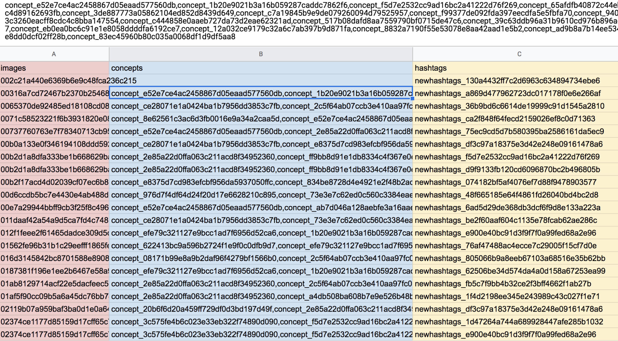
- Now in the concepts column we have, for each hashtag and each image, all the 20 concepts associated, separated by a comma. We now have to split this column in different columns, and we can do that in Open Refine by clicking the concepts column and go to > edit cells > split multi-valued cells > by separator “,”. Then click on the images and hashtags columns and go to > edit cells > fill down.
- The resulting file will look like this [6_hashtags_concepts_images]:
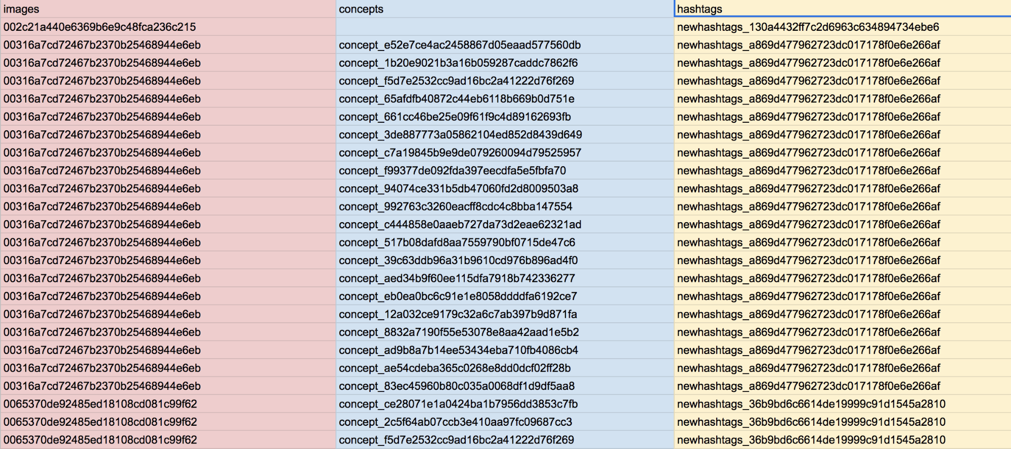
- The next step is to replace the IDs of hashtags and concepts (which are displayed with an alphanumeric code) with their labels (which contain the actual names of hashtags and concepts). The correlation between IDs and Labels can be found in the first NODE table that we extracted from Gephi. In a new sheet, keep only the two columns of concepts and hashtags, then add other two empty columns to perform two different =VLOOKUP formulas, one to search the IDs of the hashtags in the [1_nodes] sheet and return the values in the Label column, the other to look for the IDs of the concepts and return their labels.
- To count the number of times that one hashtag co-occur with one concept, we did a pivot table [8_count of concepts per hashtag], counting the number of concepts per hashtags.
- Set the pivot table to show hashtags as Rows, concepts also as Rows and values as Count of concepts. Then order both the Hashtags and the Concepts per Count of Concepts (decreasing), and check “fill down rows values”. This will show different numerical values that relates hashtags and concepts. Each value is the number of different images that have been tagged with the same hashtag and concept.
- Finally, to compare how different hashtags were represented with different concepts, we selected three main hashtags and the top 10 concepts related to them [9_Rankflow], and we copy pasted the table in the Rankflow tool.
- Here again is the dataset with all the steps.
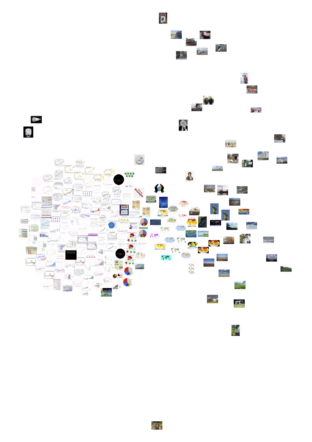 Wikipedia image-clarifai tag network, displaying only images, for 10 climate change-related articles.
To create a zoom-in on the Global Warming article, we used a script by Mathieu Jacomy, to obtain the images for the Global Warming article versions on the 31st of December of the years 2009-2018. Next step was to visualise the data in an image timeline (or ‘image wall’), to compare with those of Google Images, Twitter and Instagram.
GitHub with data + scripts: https://github.com/jacomyma/dmi2019_wikipedia_images
5. Findings
We produced image timelines by platform to show the top 10 images for each period of time, moving chronologically from left to right. These provide a visual overview of trends over time, and keep with the ideal of analysing images through the production of new images and visualisations (Pearce et al., 2018). We complemented these image timelines with tag timelines, showing how image content changes over time on certain platforms (using Clarifai or Google Vision to identify image content). Google Images 2008-19 (annual):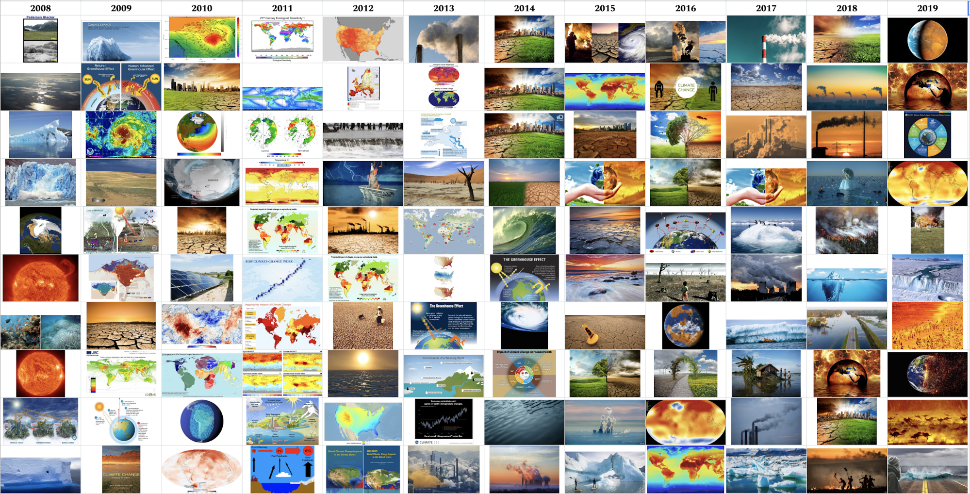 The overall impression here is one of birds-eye/planetary scale images, through photos, satellite images or manipulated images of the Earth. Landscapes also feature, either of ice/glaciers or parched deserts. Notably, people are absent from these images, and there appears to be a reddening of the images in recent years (on the right of the visualisation).
These features remain visible throughout time, suggesting that Google Images has a remarkably consistent visual vernacular of climate change.
We then used Clarifai to try and identify trends in image content within the top 100 image in each year, with tags allocated to each image:
 The idea of a persistent visual vernacular is supported by these results, with the tags ‘no person’, ‘travel’, ‘nature’ and ‘sky’ appearing prominently. Also, ‘illustration’ and ‘map’ appear consistently, representing scientific charts and maps, as well as ‘ball-shaped’ and ‘spherical’ representing images of the Earth.
Finally on Google, we experimented with the faces option to try and identify the presence of any ‘climate celebrities’ within Google search results:
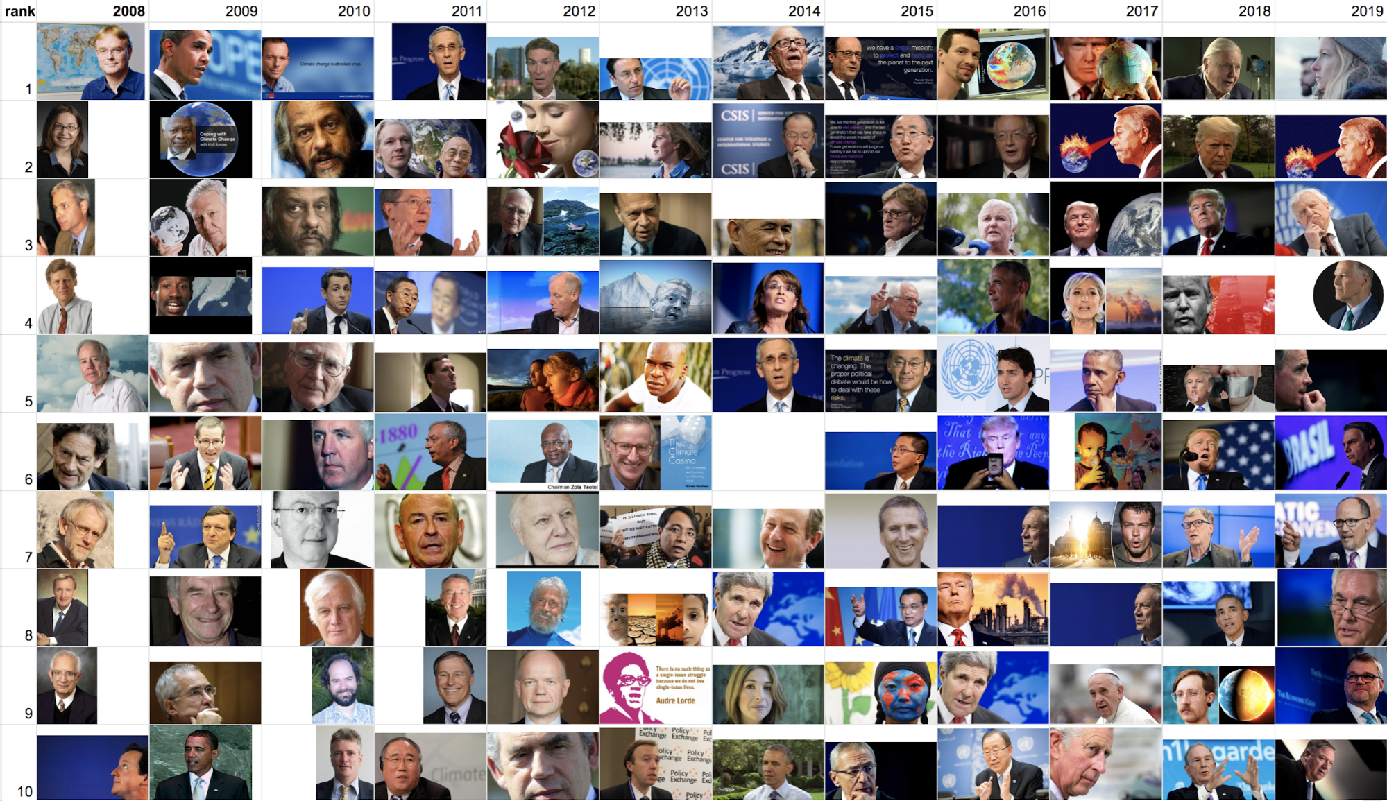 Here, we can see a predominance of white men, although without too much persistence of particular faces over time. We then tried to identify the faces using Clarifai (see Methods for more details):
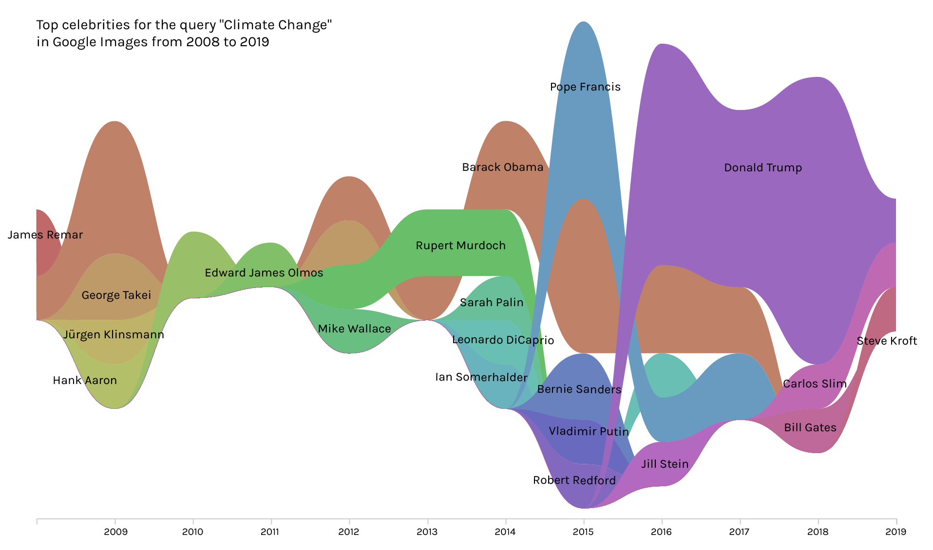 While some of these results were unsurprising (eg Donald Trump, Leonardo DiCaprio), others made less sense. So we went back to cross-check some of the names identified by Clarifai against the actual images. This revealed errors in the face identification. For example, George Takei was mis-identified as a face within the dataset, when in fact it was Ban-Ki Moon:

 Twitter 2016 (Q3) - 2019 (Q2)
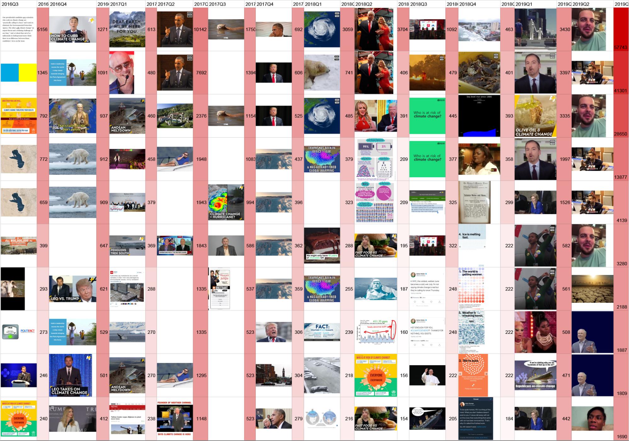 We produced a similar image timeline for Twitter, with the addition of the frequency with which the URL appears in the dataset (this mainly represents retweets, but could also be the same image URL deployed by different users). This suggests Twitter has a quite different visual vernacular to Google. Notably, humans are more present throughout the dataset, with recognisable figures including Bill Nye, Pitbull, Barack Obama, Donald Trump impersonators and Chuck Todd. Some scientific charts are present, with occasional satellite images. Most notably, and perhaps to be expected when looking at Twitter, is the presence of memes. In particular, the presence of two meme images (both appearing three times) in 2019 (Q2). The original source of the top “laughing guy” image (unrelated to climate change) is here, on the left, with the re-use of the same video for a darkly comic tweet about climate change on the right:

 What is notable here is that the frequencies for this image dwarf those from the rest of the time series, totalling almost 90,000. This reinforces the result of a previous DMI project that showed how a comedic tweet with an image about the US withdrawal from the Paris agreement became far more highly shared than content from leading politicians and celebrities.
As with Google Images, we then used Clarifai to identify trends in image content:
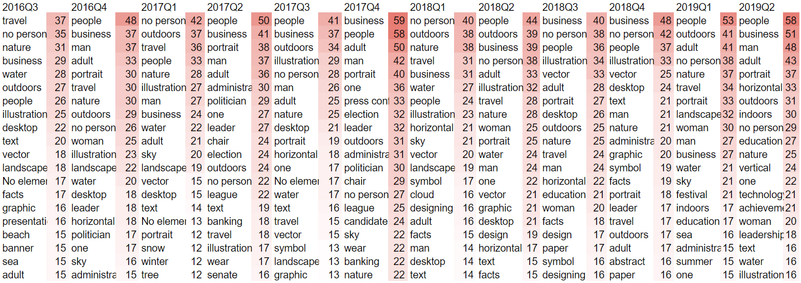 Here, we see similarities with Google (illustration, nature), but also notable differences (people, man, woman, business).
Finally on Twitter, we used the image-hashtag-image tag network to try and identify the image content related to certain popular hashtags. This was experimental and time-consuming to discover a method that worked. Here, we present a rankflow diagram for three popular hashtags in the climate change dataset: #environment, #spreadawareness and #climateaction:
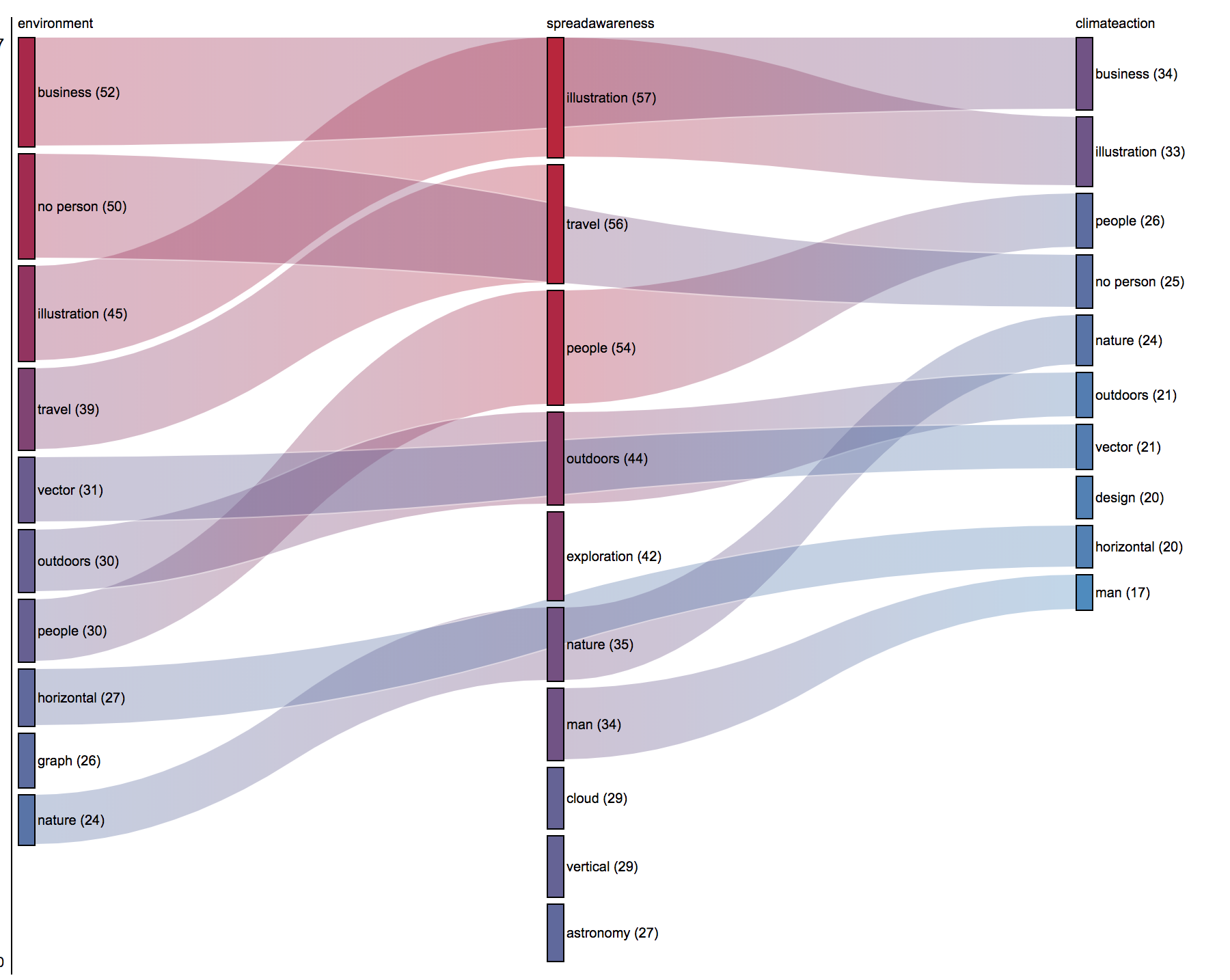 Some interesting results are notable. For example, ‘no person’ features as a prominent image tag in #environment and #climateaction but not in #spreadawareness (where #people is prominent). Likewise ‘business’ (which we found to often mean images containing text and logos) features in #environment and #climateaction but not in #spreadawareness. Lack of time prevented us from investigating these results further, but we suggest that this might be an interesting approach for future research, in trying to identify the visual vernaculars associated with particular hashtags, and addressing the question of how different types of image are used to make publics around climate change/
Instagram, most liked images (2017-19, incomplete dataset)
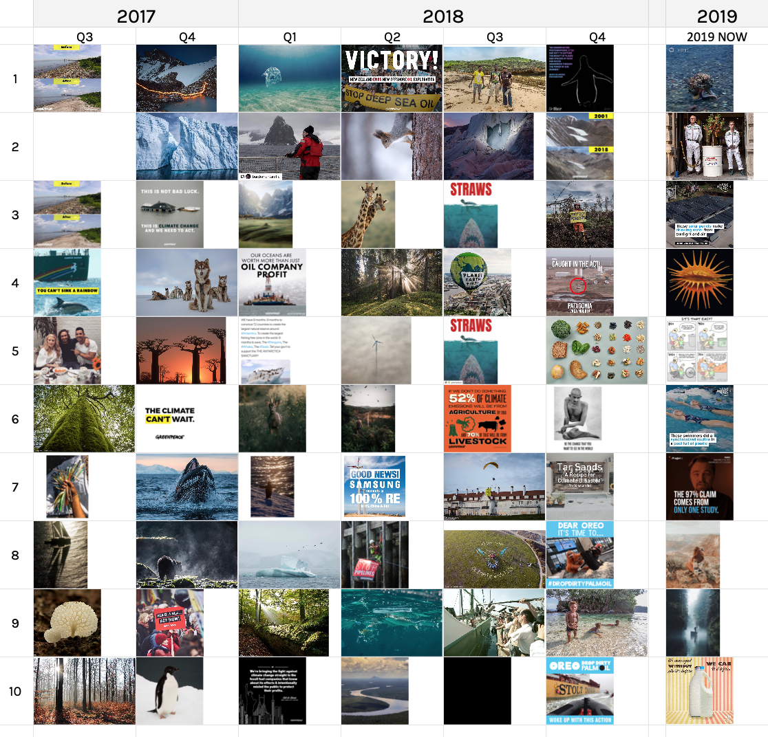 Due to problems with the dataset, we need to be cautious about interpreting these results. However, we can see more aesthetic travel and nature style imagery, targeting consumers with campaigns (waste, food, plastics). Text image macros are more aesthetically pleasing than your average social media meme (eg the “STRAWS” image).
The Clarifai analysis summarises these observations well:
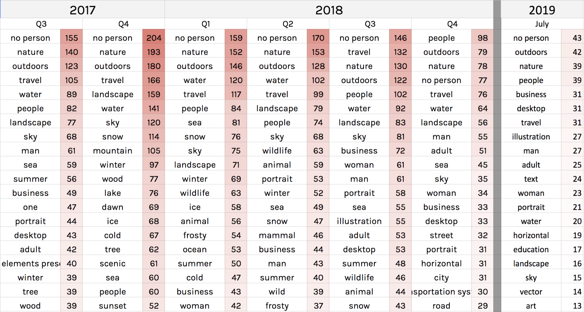 Here, we see ‘no person’ again dominating, with ‘nature’, ‘travel’ and ‘landscape’.
We then used a different method to visualise the Instagram images as a network, this time using Google Vision rather than Clarifai. Images were clustered by the image tag allocated by Google Vision:
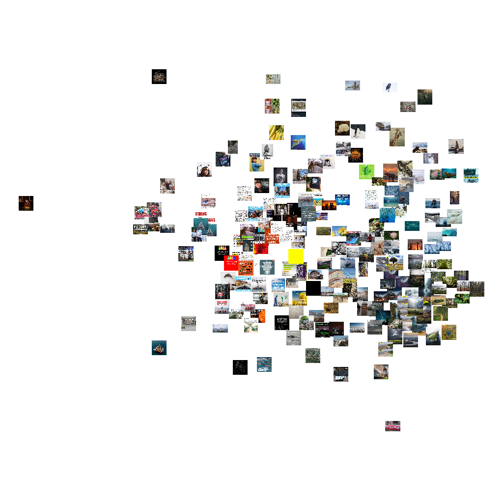 We then colour-coded the image nodes for each year, and overlaid the image tags (label scaled according to degree):
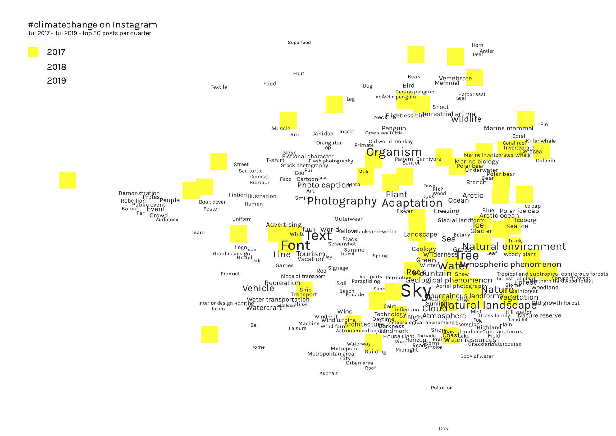
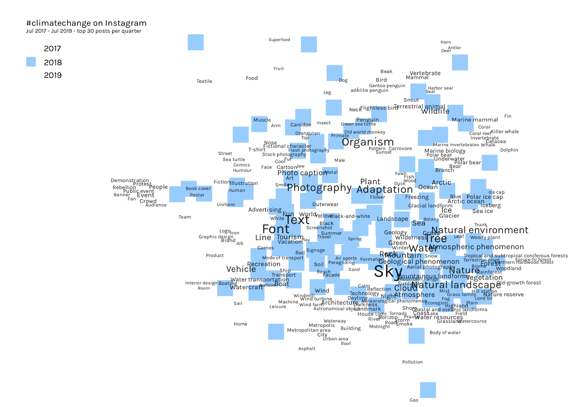
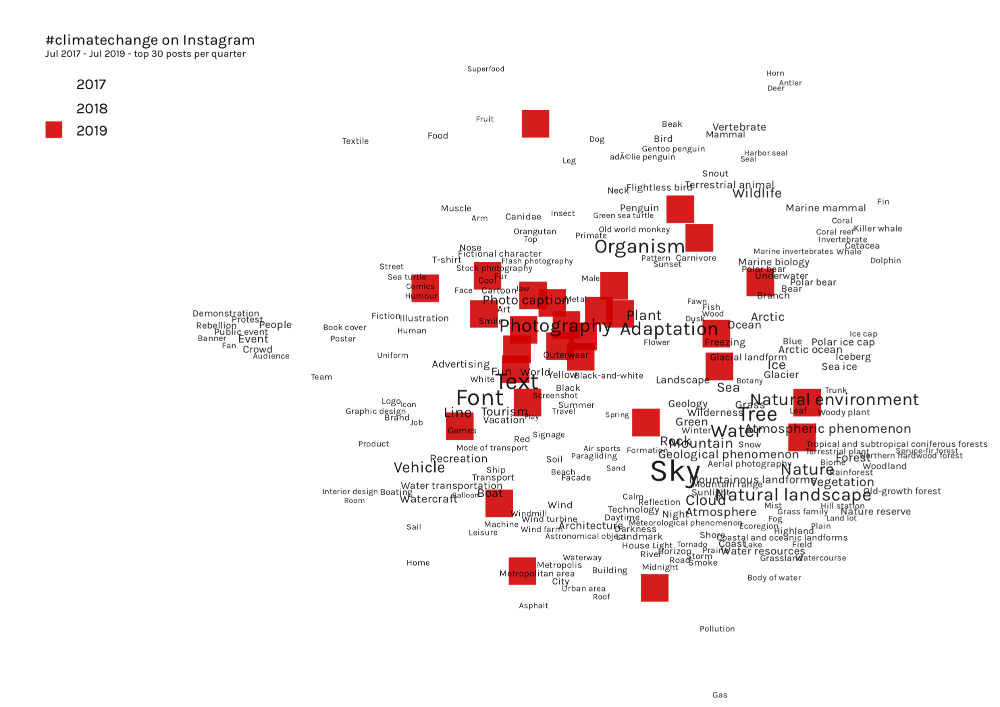
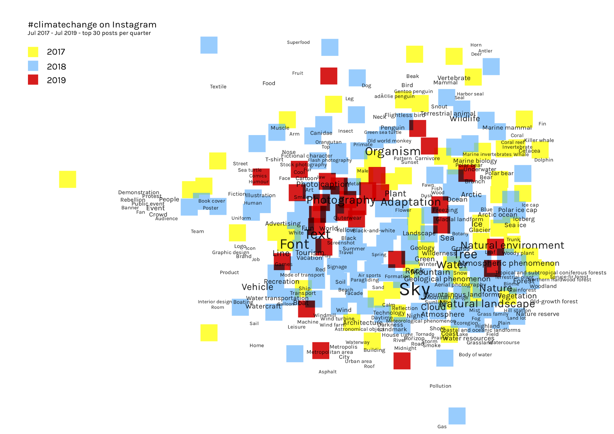 By separating the images out by year, while maintaining the tag network for the whole dataset, we can see a migration of the images around the network over time:
While these results should be treated with caution, it does illustrate a potentially useful method for visualising the changing content of images over time.
 Wikipedia, 2009-2018
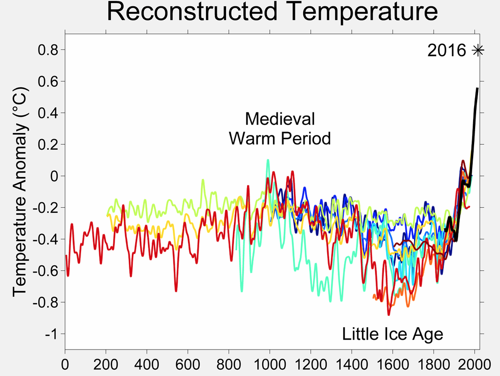
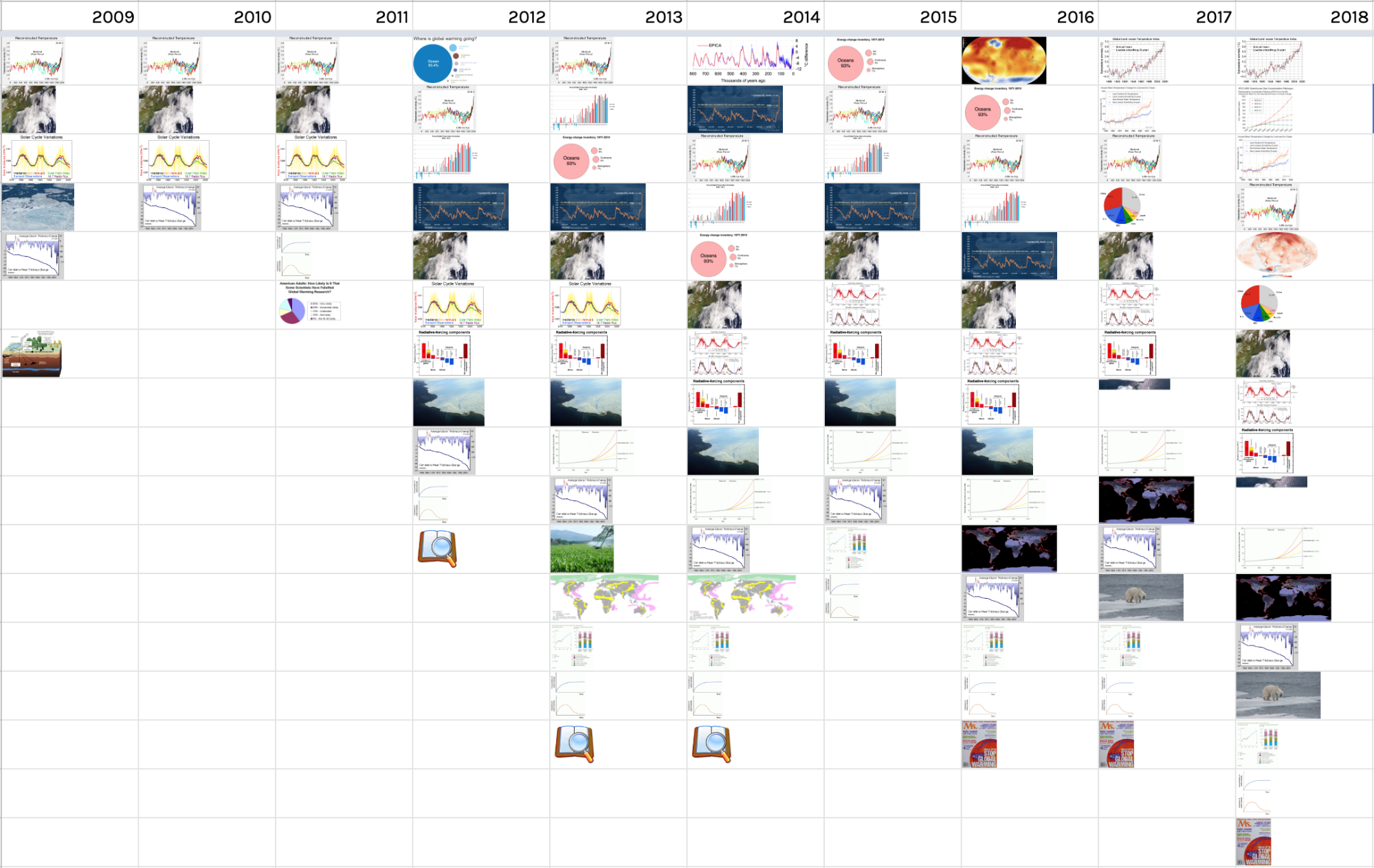 This image timeline shows a snapshot of the “global warming” Wikipedia article (that discusses current climate change) on December 31st of each year from 2009-18. Two key trends are apparent. First, that the number of images in the article has increased over time. Second, that certain images have been very persistent. For example, this image (titled “2000 Year Temperature comparison”) has featured prominently throughout the history of the article (first in 2009, fourth in 2018)
 Not all images featured on Wikipedia are so self-explanatory. For example, a new image appears at the bottom of the article from 2016-18:
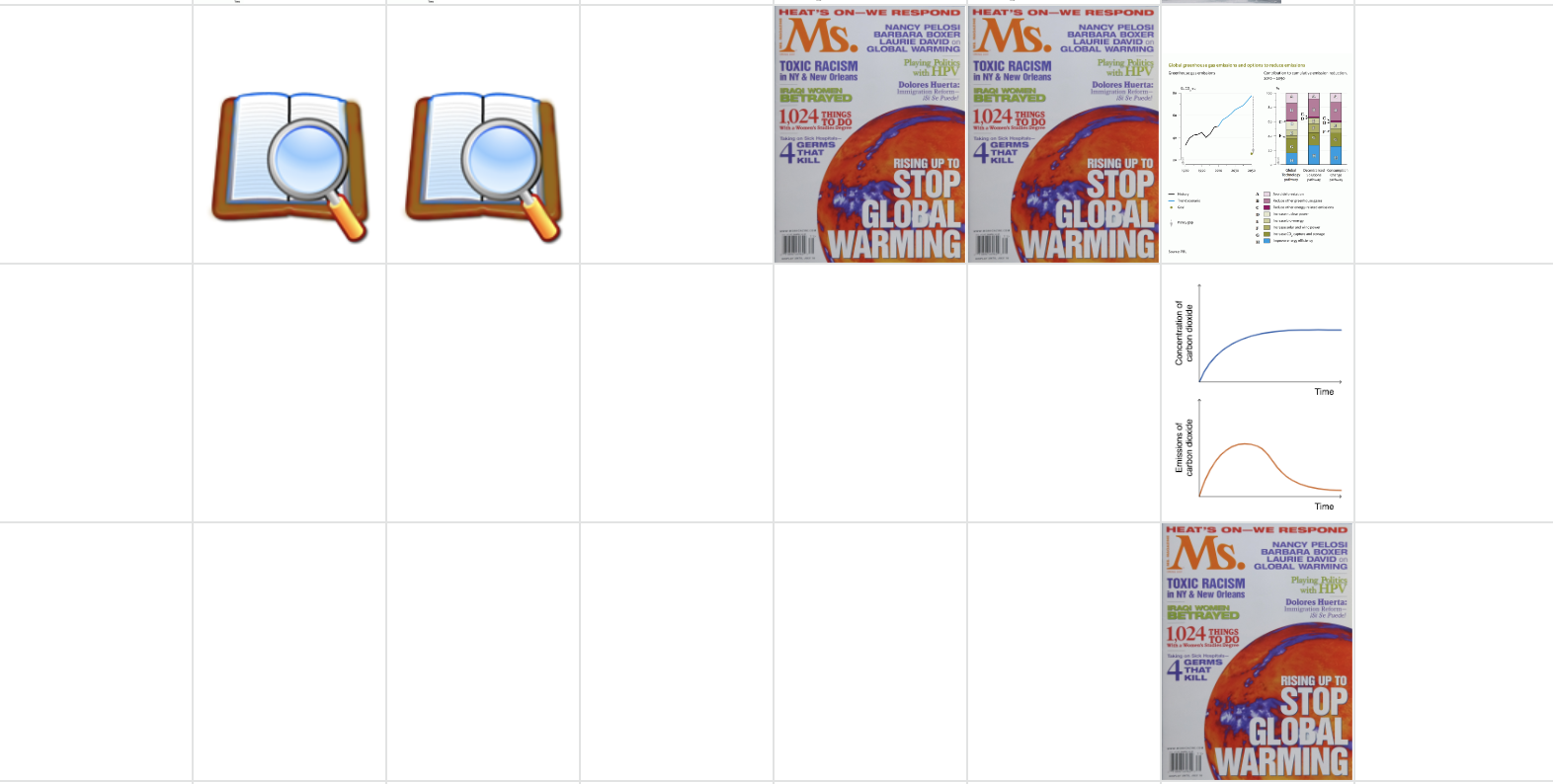 This cover image of the US women’s magazine Ms. is included due to a cover story about global warming. The image is used to illustrate a section of the Wikipedia article titled “Public opinion and disputes”.
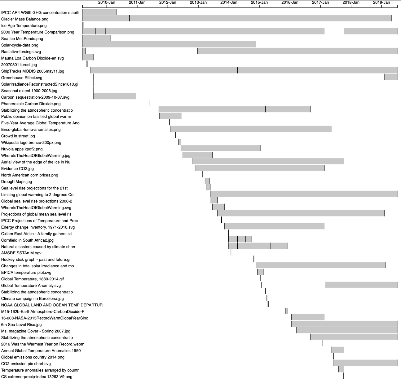
Image persistence and rhythm can also be visualised in a Gantt-style format. Here the 2000 year comparison image above is the fourth bar from the top, showing that it has been present for almost the entire history of the page, other than a period during 2017. Visualisations for all ten articles we studies can be found here.
 An image tag network of Wikipedia images (using Clarifai) demonstrates the cluster of scientific charts and illustrations, much more prominent than in the other platforms:

6. Conclusions
Our main finding is that platforms have distinct visual vernaculars of climate change, and that these remain relatively stable over time. For Google Images, we see the dominance of images that take a global, abstracted view of climate change without people. We also saw a suggestion that images were becoming more red in recent years. In Twitter, we saw more people more people (mainly politicians) but also the entry of climate into popular culture through the ‘laughing guy’ meme. On Instagram, we saw more stylized travel images, and more aesthetically pleasing memes. Wikipedia remains dominated by graphs and charts, with a notable increase in the quantity of imagery over time, and the persistence (or ‘stickiness’) of certain key scientific charts over many years. In some cases, more robust datasets are needed to make stronger empirical claims. In particular, Instagram remains a very challenging platform on which to obtain historical data. The project made important progress on visual methods around the use of image tags, and demonstrated that in some cases Clarifai’s tags can have important uses (in particular, the contrast between ‘people’ and ‘no person’ which is not provided by Google Vision). There is more research needed using the methods around face recognition, and the matching of image tags to Twitter hashtags. The latter could be particularly valuable in identifying the role of images in politicising climate change on Twitter.8. References
List your references in a standard academic bibliographic format. GOOGLEEdit | Attach | Print version | History: r4 < r3 < r2 < r1 | Backlinks | View wiki text | Edit wiki text | More topic actions
Topic revision: r4 - 14 Aug 2019, WarrenPearce
 Copyright © by the contributing authors. All material on this collaboration platform is the property of the contributing authors.
 Ideas, requests, problems regarding Foswiki? Send feedback


